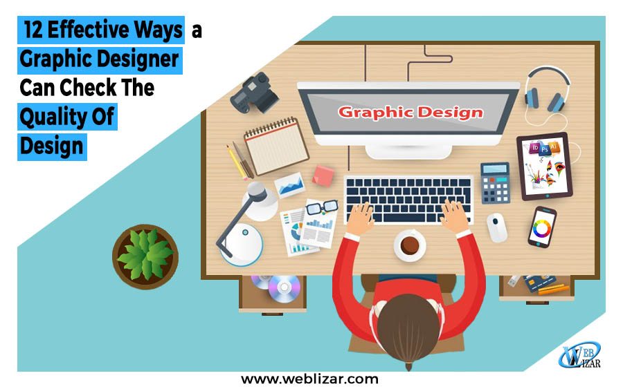
12 Ways To Check Graphic Designer’s Quality Of Design
- Graphic Designing
- awesome graphics, best web designing, designing quality, graphic designer tips, pro tips for graphic designing
12 Ways To Check Graphic Designer’s Quality Of Design: Graphic designers are trained professionals. They know the importance of designs when it comes to making the desired eye catchy and feature full designs that can lure your customers onto your website.
But sometimes even trained eyes fail to judge a design with impartiality due to closeness with the work. However, if a designer checks out a key list of design features, timely improvement can be made in the design for simplicity, quality, and impact.
If you are a designer and have non-designer friends around when working, ask them questions like ‘Why are you using this font,’ ‘Why are you choosing red over blue’ and other similar novice queries that keep bumping your desk.
This mystifying experience of what a designer does is indeed impossible to explain unless they have a knack for it. Even beginners find it tough to figure out the points and choices to be considered when it comes to the best design output. Well for them, there is no definite formula to make the best.
Graphic designers usually trust their visual instincts to check if a design is good enough to impress the audience. However, remember that every individual has different choices. 12 Ways To Check Graphic Designer’s Quality Of Design. So, what you think is aesthetically pleasing at its best might just not be so for your client.
12 Ways To Check Graphic Designer’s Quality Of Design
Here are the 12 best ways to check Graphic Design Quality:
1. Locate the Focal Point
Planning, designing, and reviewing are the three-block steps in creating a design. To find out the main focus of a design, ask the pivotal question – what is the purpose of this design? Find out if it is the graphic, the image, or the content.
If you use simple black-and-white typography with an elaborate illustration, the viewer will find the focus on the image first then the text. It is not possible to emphasize every part of a design and neither is it required.
Color, texture, shape, direction, position, size, etc. are the elements, which can make the visual weight vary and thus create the focal point. The boldest or the largest text or image can sometimes be used to highlight the spotlight of the graphic design and make sure that’s vividly there in the final output.
Suggested Post: Build Your WordPress Website to Be SEO-Friendly
2. Maintained Visual Flow
The focal point is not everything in design. The audience’s eye should also be able to navigate the rest of the layout comfortably, and that qualifies it as a good design. The hierarchy of a design helps to let the viewers understand, in the blink of an eyelid, what is important in the graphic design and what is not.
The design elements including the white space, text, etc. should be placed such that it automatically focuses on the crux of the design. Without any clear organization, the design will not have a visual smooth flow.
Repetition in the design elements creates unity in design. Organizing with headings, sections, bullet points, etc. divide the design into clear sections. Lastly, the appropriate use of white space helps to avoid a cluttered design.
Suggested Post: What is Responsive Web Design? How to Check Responsive?
3. Design should be Equally Balanced
Symmetry is one of the biggest contributors to a design. If you have chosen to make a symmetrical design, make sure that the central axis is maintained. Besides being aesthetically pleasing, this type of design also helps to form the hierarchy of the design layout.
Vertically, horizontally, or radially – whatever the alignment, maintain the balance. Poor alignment with improper margins throws a design off balance. 12 Ways To Check Graphic Designer’s Quality Of Design.
The grid feature helps to create the alignment perfectly. The human brain finds symmetry more attractive than any other style. Maintaining one type of alignment throughout for text-rich design makes it easier for the eyes and hence a good design.
4. Is It In Balance Form With Function?
What is that one thing that makes the design ‘still’ and not serve the intended purpose? What keeps it less communicative than the rest of the designs? It is the balance.
Losing sight of the message of the design is disastrous and consequently, makes it purposeless. Apart from being visually appealing to its audience, graphic designers should also communicate its message successfully.
Suggested Post: How Instagram Inspires the Features of Web Design
5. Accord Typefaces used?
A key part of almost any design is typography. Well-chosen fonts create a major influence on the overall attractiveness of the design. Two or more typefaces, that are not complementary to each other, serve as a huge distraction to the viewers.
For beginners, it is wise to stick to one sans-serif font and one serif font. One thing to remember is the mood and personality of the tone of the text and then choosing the font. Again, it is not such a clever idea to use fake italics for fonts that do not have them originally.
Many graphic designs are typography-based. A majority of logos have company names, which requires careful use of typeface for the desired result. If you are a business owner and need a typeface-based logo or any other design such as a business card, the crowdsourcing site Designhill can deliver you great designs.
This platform has hundreds of skilled designers who will give you dozens of new design concepts in response to your design brief. If not satisfied with the designs, Designhill will refund your entire money under its 100% Money Back Guarantee scheme.
6. Contrast is the Key to Eye Catchy Design
Contrast is an important element for making a graphic design appealing as well as functional. To put more emphasis on certain elements of the design, the simple choice of color won’t serve the purpose.
Shape, scale, and typography are the supporting elements of contrast that bring out the drama in the text. Contrasting design elements, however, should be placed in a complementary way.
7. Design and Text Format should go hand-in-hand
What do graphic designers do to help set the mood of the design? Typography styles, color choices, and some other elements should be aligned to make it the mood that the text demands. Kid’s coloring contests can have autumnal color shades but in no way should be black and white! A serious font with dab colors can be ideal for a serious impactful meeting banner.
White space is all about giving your design elements some breathing room. Cluttered, crowded design loses the focal point of the design.
Suggested Post: How to become a successful graphic designer
8. Text should be Neat and Readable
What defeats the purpose of design is that nobody can read what is written on it. Size is thus one thing that looks much larger on screen but looks different when printed. Print out a proof of the design before the final output. Do not use impractical fonts.
Typefaces in all caps increase the scope of readability and are often used as the technique for writing important information such as address, price, etc. The sharp contrast in colors between dark and light colors also serves the purpose.
Lastly, choose the perfect font style. While some fonts are easier to read others may be too cursive, not enough to read from a distance. Display fonts are best when used sparingly.
9. Available Space shouldn’t look Awkward
For different design projects, there is a different amount of space available. It is a challenge to make the most of the space keeping in mind to leave adequate white space and yet convey the entire information.
A couple of basic principles should be maintained to get it done. For instance, the proximity that placing the related pieces in an organized layout can create a logical section.
White space is all about giving your design elements some breathing room. Cluttered, crowded design loses the focal point of the design.
10. Use High-Resolution Images
After creating a graphic design that you are proud of, wouldn’t it be sad to see the images as pixilated in the final print? A solid understanding of the correct resolutions along with the format requirements is a fundamental thing to know to get a comprehensive look at the design. 12 Ways To Check Graphic Designer’s Quality Of Design.
Suggested Post: 5 Ways to Build Your Brand Image
11. Design should Speak for the Topic and Content
While designing for a creative brief, it is wise to stick to the basic creative brief template as mentioned for a good graphic design. Do not go completely off the brief just to make it visually pleasing according to your aesthetic sense.
12. Bothered By The Harmonious Color Scheme?
It is necessary to understand the deep, subconscious significant color shades often used. Apart from considering the moods colors can portray in the graphic design, one should also think of the combination of colors used.
Conclusion
Graphic designers should review their work extensively to find out if it creates a desirable impact on viewers. Make sure that the focus of the design is where it should be. Check also the balance of varied design elements. See if the visual flow is right and contrast, if required, is just perfect. Readability of text, color scheme, and correct resolution of images are other things a designer must check before finalizing the work.
FAQs”
How do you evaluate quality of design?
The quality of design is evaluated based on various factors, including functionality, aesthetics, user experience, and adherence to specifications or requirements. A well-designed product or system should effectively fulfill its intended purpose, be visually appealing, and provide a positive and seamless user experience.
How do we measure design quality?
Design quality can be measured through various metrics and criteria that assess different aspects of the design process and outcome. Usability testing provides insights into how easily users can interact with the design, while adherence to specifications and requirements evaluates functional aspects. Aesthetics and visual appeal are often assessed subjectively but can still be measured through user feedback and surveys.
How do you know if your design is effective?
An effective approach to assessing the quality of your design involves a comparative analysis with both your own previous designs and those created by others. This method offers a broader perspective, allowing you to discern the strengths and weaknesses of your design. By juxtaposing different designs, you gain valuable insights into best practices and prevailing trends within your field.
school management


Leave a Reply