


E-Commerce Checkout Page
A website attracts, distracts or repels any prospective customers. The design of your E-commerce website matters more than one would think. Did you recognize nearly 33.9% of website visitors leave the location once viewing only one page? The fact is it’s not an easy task setting up an e-commerce business. You have to spend time finding the perfect layout, creating gripping descriptions, and organizing your product photos. All your time and hard work spent on optimizing the front end of the website will be of no use; if your checkout process is confusing or seems uncertain to your customers. Due to this, you will never be able to maximize conversions for your business.
Unfortunately, most E-commerce techpepe websites don’t do check out very well. I believe this is mainly because the website owners’ business objectives have been put, before the needs and want of the customer. The cart checkout process is at the heart of any online shopping spree. This is your customer’s first impression of your business. And your first opportunity to convince them to stay, browse and buy all that you have to offer.
Creating an optimized, updated, and a highly functional eCommerce website design sure plays a pivotal role in assuring customers. With your professionalism and trustworthiness, as well as magnifying the perceived value of your products but when it comes to buying, an online store’s checkout so much surpasses the other part of the website in terms of importance. So, how does one create the perfect shopping cart checkout? Let’s dig a little deeper:
1. Offer guest checkout:
In online shopping, nowadays, guest checkout is one of the most famous tactics and an essential factor in marketing strategy. Almost 23.6% of online customers will abandon the cart if you force them to register first. Make sure to allow your customers to proceed to checkout with an option as either signing in as account user or as a guest. Quite often, the gathering of customer knowledge is completed at the primary purpose inside the checkout. By forcing users to make an associate account, before they will even complete their purchase; this hinders the checkout method.
Also, keep in mind that you have the registration form further down the checkout process so you provide guests an opportunity to browse product in your e-shop and at last proceed to the purchase. This way you are not imposing customers to register an account if they don’t have one. By implementing this process, you are actually increasing the chances of converting your visitors into paying customers.
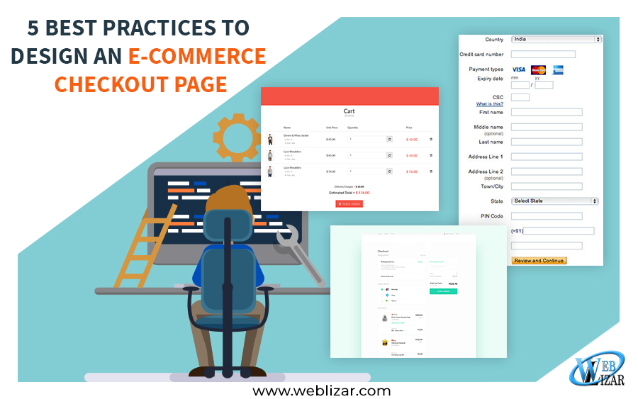
Your website, as well as your checkout page, should be mobile friendly. Half of the consumers leave the site when it comes to checking out as it isn’t mobile friendly. Customers want to place orders hassle free. The main goal is to make your visitor registration experience as smooth as possible either by visually showing any errors or any missing fields. Also, what you can do for your existing customers is that you can add an auto-filling option and help them retrieve forgotten passwords as well.
2. Capture the user’s email address early:
The bitter truth of eCommerce, whether you like it or not is that you will never be able to convert 100% of the users who reach the checkout page into potential buyers. So, the most important thing that is advised is to grab the user’s email address as early as possible, often as an independent first step.
This requires the user to enter their email address at the very start and choose whether they want to examine out as a guest or produce an account for later use. It also tells the user whether the email address is already in use. The main objective behind grabbing the e-mail address is for user knowledge collection and also for shopping cart abandonment campaigns. Without an email, one cannot launch the abandoned cart email series, which often brings back at least 15% of customers who add an item to the cart, and then decide that they don’t want to purchase.
3. Add Live Chating:
Several reports show that launching a live chat feature on the website boosts conversion rate and even increases sales significantly. It is essential that eCommerce companies assist customers just in case they create mistakes in filling out the online forms. Imagine how impressive it would look if the consumers got to know all the information about the products in real-time without wasting their precious time. This would keep them updated about their product and also build mutual trust between consumers and buyers. It would also be helpful that when customers fill in the fields wrong, the web application spots the error and highlights it. Error notification would be displayed to shoppers, elaborated and explained as far as possible. The consumers would get updates about their products and also FAQs in real-time.
4. Easy Checkout Options:
Provide shoppers with easy checkout options and a visual indicator of where they are in the checkout process with a progress bar. This will help relieve the impatience that is growing while filling out several forms because they would know that they are near to completion.
Cart abandonment is a major issue that we have to tackle, an optimization technique that can be used in decreasing the abandonment rates is an enclosed checkout process. What do I mean by this, you ask? What I mean is that we choose a design approach where we exclude the navigation menu and other visual elements from the checkout page. For example, Magento 2 custom checkout fields help you to quickly add customizable fields to the Magento 2 checkout page without any hassle and save time and patience that is growing thinner by the minute. A cart checkout can look impressive only you format the main points in a manner that’s simply understood by a user.
The content of the page should be written in a way that is easily grasped by the user. It is advisable to use the Readable Table-based Layout in the checkout page. So, the users will be able to see the product details clearly. Ideally, the checkout page should be only one and the faster it is for customers to place an order, the quicker it will be for you to secure those sales.
5. Display trust signals throughout the checkout process:
Users really start to think about security when they reach the most sensitive parts of a site. For online shoppers, it’s when they reach the MasterCard form field on a webpage. That they’re on your guard in terms of what the safety of a page is truly like. You need to show trust signals throughout the user’s journey, as it is something that comes across very obvious. But this isn’t always implemented on websites. Most users don’t want to take out the time and give a ton of personal unnecessary details when creating an online account.
One very useful way of achieving this is with the help of an “info” button. You can reassure your users by adding an asterisk right next to the field. That is important to fill out e.g. email address, phone numbers and so on. When it comes to paying, you’ll see that some websites jump you to a third-party checkout provider. Rather than keeping the shopper on their own domain. This is often because the business hasn’t purchased an SSL; while this is safe, it can disrupt the user flow and cause distrust. Users have loyalties and trust different providers, so the more payment options your site has, the better. Lots of retailers now offer options like pay after delivery, partial payments, PayPal, and many more which are gradually becoming more trustworthy and important to users.
What kind of experience do you want to offer on your website? A quick, easy and pleasant shopping experience that will lead to content customers. These are some of the proven ways by which you can create a checkout system on your e-commerce website. That will ensure an easy and smooth experience. A smooth checkout flow will increase profits for your online business, increase the customer experience satisfaction levels. And will play a vital role in decreasing the cart abandonment rates. I admit, there are different ways in which, too but, it is a guarantee that implementing these 5 easy changes can help you remain the correct track.