


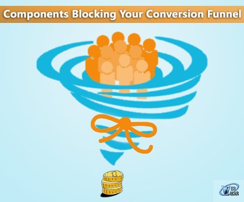
The main reason of one behind building any website is to make the most out of it and by most I meant carving out maximum of the business as possible. And that’s where conversion funnel comes into the picture but there are some components those need to be taken care of before building your conversion funnel.
You must be putting tons of efforts to maximize your website conversions, but are they where they should be?
It is really frustrating when you see that visitors are coming on your website but they are turning away due to badly implemented strategies for conversion funnel. In this post, we will talk about the 8 reasons that could be disrupting the process and turning your visitors away.
1. Ugly Design
The most common reason that turns your would-be customers away is the bad layout of your website. If you want to improve conversions, then you need to make the layout confusion free.
If you are having a cluttered design, then you are deliberately prompting your customers to leave. Even with a minimalist design you can put your visitors at ease and lower down your bounce rate.
Color schemes play an important role in conversion than you may think. So, you must choose the colors of your layout carefully based on the emotions you want your visitors to feel.
2. Lousy Visuals
Online marketing is completely done through visuals and content, so the quality and type of images you are using on your website matters a lot in making conversions.
According to studies, 92.6% people consider the visual factor while making decisions which means that you should be very selective with the images.
If you are using crappy imagery on your website and still thinking of the reasons you aren’t getting conversions, then you are just wasting your time.
3. Page Load Time
Nothing can be as bad as a slow loading website, as no one has the time to waste waiting for your site to load.
According to a Research, almost half of the users abandon your site if it doesn’t load within 3 seconds. So, a lack of speed is eating up your conversions.
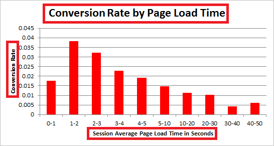
Bigger images also slow down the website, so it is recommended to reduce the image file size to prevent the images from increasing the loading time.
4. Irksome Pop-ups

Most of us abandon the sites when we get hit with these annoying pop-ups. When 80% of the people who visit your site either dislike or hate pop-ups, then what’s the reason that you are using it on your website?
If you want your visitor to convert, then you can ditch this altogether and let someone check out your site as a guest for once. And, later show them the pop-up to collect their email address when they visit again.
5. Bad Copy
If your website is having a bad copy, then it could be one of the reasons your visitors are not making the action you want them to take. If you have a sales copy, then many of your visitors will run away instantly.
The copy of your website should be persuasive and clear to warm up the leads before they get ready to convert.
6. Confusing Navigation
If your website is so confusing that it cannot take visitors where they want to go, then you are forcing them to leave instead of staying.
Your website visitor should be able to easily navigate your site if you want to increase your conversion rate. It should always be simple and intuitive to decrease the bounce rate.
You should not also include too many navigation items, as this puts a paralyzing effect on them and they get confuse and leave.
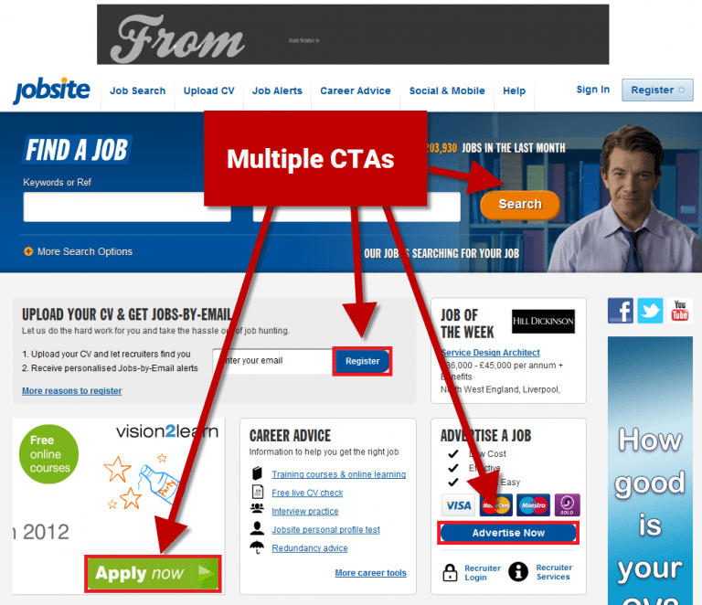
7. Multiple CTAs per Page
Each landing page should be solely dedicated for one purpose and should have one goal for the visitors. So, your website should have one compelling call-to-action instead of having too many irrelevant ones.
A website with multiple call-to-actions will have half number of conversions when compared to the one with single CTA button. Because when you reduce the number of options, then it becomes easier to make a decision.
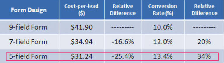
8. Greedy Forms
A greedy form is the one which has too many fields or ask for more information than required. There’s always a limit to how much information people would like to provide in a form. So, it is essential to use the right number of fields in your website forms.
According to studies, a form with too many fields reduces the conversion rate. So, to decrease the number of fields you can remove the ‘Retype email address’ field in your signup forms.
Wrapping Up
You should check your website every now and then for any loose points or hidden problem, there is no harm in doing that. It also ensures that you are not loosing your potential customer and traffic at the same time.
So start saving your websites conversion funnel by avoiding the above mentioned points while strategizing your conversion funnel.
Also don’t forget to read interesting story of Doctor Roy and SEO-Friendly Content To Boost Your Websites Online Presence.
Alongside with conversion funnel, Gamifying Your Website For Better User Interaction can also be a choice for many.