


CTA or Call-To-Action button is hugely effective in bringing eyeballs when done in the right way. And when a visually compelling CTA gets a couple with an attractive offer, it really becomes an inevitable way to make people take the action you want them to. This capability of luring people to upsurge the click-throughs makes CTA a highly important element to design.
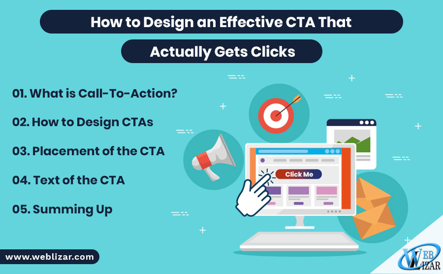
What is Call-To-Action?
Those who think that CTA can only be a button are simply under a great misconception! A CTA can range from being a video, image, text, or a button that contains a link to a page, where the users will get an intriguing offer. The main motive of the CTA is to grab the users’ attention and make them click through to learn more, make a purchase, or get a subscription to name a few. As per Intlum’s web design principles, two main types of CTAs found on an average:
CTA Type 1:
This leads the visitors to a product page or informational page where the users can learn about your services/products or can make a quick purchase.
CTA Type 2:
A vital part of an inbound marketing method, the second type of CTAs direct the users to a landing page where they can fill up a form and download or signup for some kind of free material/offer like free eBook, coupon code, guide, etc.
CTA Type 3:
Here, the CTA plays a medium between the company and the potential buyer, leading them to the contact page (or similar kind of page) where the users can get the contact info of the company and make a call or send an email quickly.
CTA is more than just a button! It involves precise planning to decide on the color, text, shape, size, and placement. After all that made right, it can help the website owner with a lot of traffic and conversion. This promise of being capable of bringing this much of conversion to the table has made the CTAs appear for multiple occasions on multiple platforms like emails, blog posts, homepages, etc.
How to Design CTAs
Designing the CTA not limited to putting colors and selecting shapes. There’s more than one factor associated with the Call-To-Actions. You need to take care of the placement and texts of the CTA to ultimately come to a profound result that helps.
When you want someone to take action of your preference on your site, the CTA is the only way to do so. The sole purpose of the CTA is to attract and engage the users and compel them to click through for visiting a page or buying a product. That’s the reason why CTA becomes delicate and a little change in the button color, shape, copy or placement can make a major difference in the end result.
As you can see that the CTA works as the manipulator in users’ decision, it’s too important to make it as perfect as possible by testing the different variables of the button.
We’ll go through different aspects of creating a CTA which will help you in coming up with the best piece of Call-To-Action that will be driven to lucrative outcomes in the age of rapidly changing design trends.
Design of CTA
Despite the importance of text and placement, the design is always the primary aspect of a CTA that becomes vital for gaining traction from the audience. Whether it’s a familiar method like flashy arrows or something more distinct, the only thing that matters when it comes to CTAs is that they should instigate a user to click. Now, your CTA button should look like a button, which highly influences its shape and design. You can do everything in your capability to make it look like a button so that it seems clickable in front of the end-users. Designers can use shades, 3D effects, gradients and everything they have in mind to make it look like a button. However, the design s not exaggerated.
Size:
Size is the primary aspect of any button as the size defines the visibility. The more visible a button is, the more clicks it will get from the users. However, to increase the visibility, you cannot simply make it too large to appear natural. The size should be natural yet tempting.
Shape:
Believe it or not, the shape of your CTA button also makes an impact on the users’ decision on clicking through it. There’re certain distinctions among the CTA button with round, rectangular or curved rectangular shapes. The shape will also have an impact on the users’ psychology, which calls for attention to be paid to the shape of the buttons. Moreover, the shape should be decided according to the other elements on the website.
Button Color:
Probably the most defining aspect of a CTA, the button color would make the users decide whether they want to click on it. Mainly, we find the button colors to be green, blue or red. Several studies made on different button colors and the CTR (Click-Through-Rate) have made it clear that users have the tendency to click on the buttons with green more than the red in most cases whereas the scenario is different in other instances.
Contrast:
While talking about the button colors, it’s very important to mention the contrast it creates with the background of the button. The vibrant color will get more visibility for sure, but the color will look vibrant only when it’s placed opposite to the contrasting background.
For instance, if you put a green-colored CTA button on a greenish background just because you know green-colored CTA buttons get more clicks, you’re doing a lethal mistake! A proficient designer would always take care of the contrast when it comes to the CTA button!
Placement of the CTA
Above the Fold is surely a great place to put your CTA buttons on, but it’s a myth that you cannot place your CTA below the fold! After a number of studies and logical brainstorming, we came to the understanding that a higher conversion is achievable when a CTA is placed below the fold properly. That’s because the users would get a proper understanding of the service/product before they scroll down and click on the CTA button.
When a CTA is being placed, it’s preferred to use whitespace around the button to attract as many eyeballs as possible to the button. However, using too much whitespace can separate your CTA from the text that should be connected.
Your CTA should be placed somewhere it gets visibility and makes sense!
Text of the CTA
The last factor of a successful CTA (but definitely not the least) is the text on it. Though it’s not directly related to the design of the Call-To-Action, it’s still an important factor to discuss in brief. While deciding the text for a CTA, you should rely on a few rules which are as follows:
• Don’t showcase your stock of vocabulary. Use simple words that are colloquial and relatable. Those will get more clicks.
• Don’t use formal and boring terms like “Submit!” Rather you can make use of more action-driven words like “Send a Message” or “Post Your Query” or “Subscribe to the Newsletter”, which are the things people actually ‘want’ to do instead of the boring submission. CTA is all about psychology and that’s what you need to take care of.
• Try to innovate ways rather than following the same old patterns. It’s not that the first unique text will be a huge success but when it will click, you’ll shower with queries and actions.
Summing Up
That’s the way you can design a nice and actionable CTA, which will actually give you results. You should test your CTA and keep it clutter-free so that the user’s experience not hampered. The motive is to come up with a good CTA. So, don’t try to create a random Call-To-Action; give it time and it will pay you.