Top Responsive Web design testing tools In Google Chrome
- HTML Templates
- free responsive theme, google chrome extensions for testing, how to check my theme responsiveness, responsiveness of website
Top Responsive Web design testing tools In Google Chrome
What is a Responsive Web Design Tester?
Almost every new client these days wants a mobile version of their website.
And clients easy to access the website for any information on using smartphones.
It’s practically essential after all: one design for the BlackBerry, another for the iPhone, the iPad, netbook, and Kindle — and all screen resolutions must be compatible, too.
For creating compatible web pages according to whether smartphones run perfectly or not smart devices we use Responsive Web Design tester.
In the Market various types of Responsive Web Design testers like viewport resizer .. etc are available but Google Chrome has a default Responsive Web Design tester.
Responsive Web Design Tester Tools
This tool has been built to help with testing your responsive websites while you design and build them.
In the Market various types of Responsive Web Design testers like viewport resizer, screenfly, etc are available but Google has released a Tester Tool, which allows developers to view the appearance of a website on different devices using various screen resolutions.
Responsive design allows a website to automatically scale the content and the related page components across various devices such as tablets, mobiles, and laptops. This makes it easier for users to experience the website regardless of the device they’re using. This improves conversion rates and, ultimately, an image of trust for the site and its company. So, making sure the site’s design is responsive, and running tests that are responsive to the design is crucial.
Also, to make this the most efficient and 100% effective, every device must be able to have its unique design for the site specifically designed for it. For example, the design should be different from Blackberry, iPhone, iPad, and others. based on the size of their screens and resolutions. Top Responsive Web design testing tools. Top Responsive Web design testing tools In Google Chrome.
A lot of these flexible design testing tools operate in the same way which is why choosing one over another is simply a matter of individual preference. I suggest playing around with the various options before picking the one you like the most.
Free Responsive web design tester tool
Are you looking for a free responsive web design testing tool? Don’t worry google chrome is here to help you with the same.
It is ideal to test responsive web designs. It is easy to change between landscape and portrait mode, and test several mobile devices simultaneously! To get started using the program download the Google Chrome extension. Go to the website where you would like to test various resolutions. Click on the software extension icon, select the resolution size
Google Chrome Responsive Web Design tester.
Mobile Emulation in Google Chrome
With the release of Chrome 32, a new developer tool was added — mobile emulation. This tool is an absolute godsend for debugging mobile and responsive designs.
If you don’t already have it open, open it with one of the following options:
- Press F12 (or Cmd+Alt+l on a Mac)
- Click Developer Tools under View -> Developer
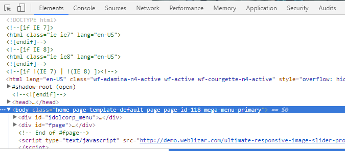
At the top of the developer tools window, you’ll see a new icon
Toggle the Device Toolbar (Ctrl + Shift + M) which looks like a mobile phone.
Click that and the mobile emulation mode will be enabled for the site you’re currently on, as you can see in the screenshot below.
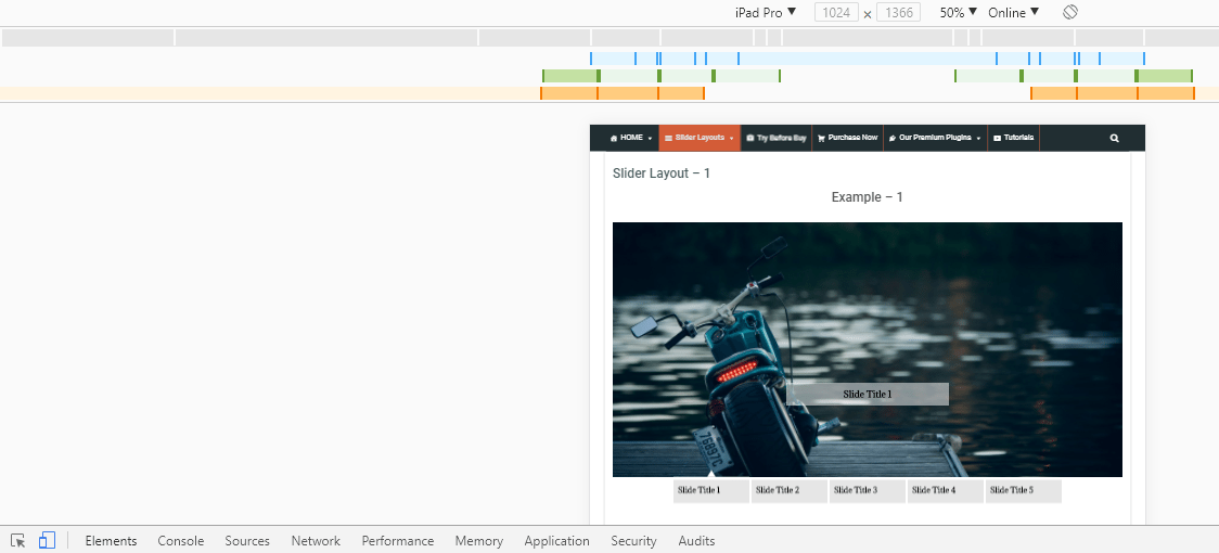
We can adjust the screen easily for the look of various types of mobile using of Toggle Device toolbar
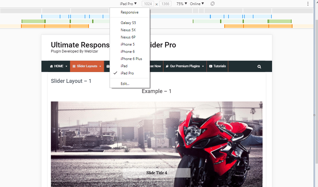
A) Different types of Screen Resolution
The Toggle Device toolbar provides any type of screen for testing by default.
- Default mobile screen – Galaxy S5, Nexus 5s, iPhone 5,iPhone 6, iPad, iPad Pro,
- Edit – we can set your screen in the editor
you can see in the screenshot below.
Suggested Post: Tag Archives: Google Chrome extensions for testing
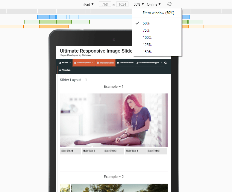
B) Set Percentage of Zooming Level
you can see in the screenshot below.
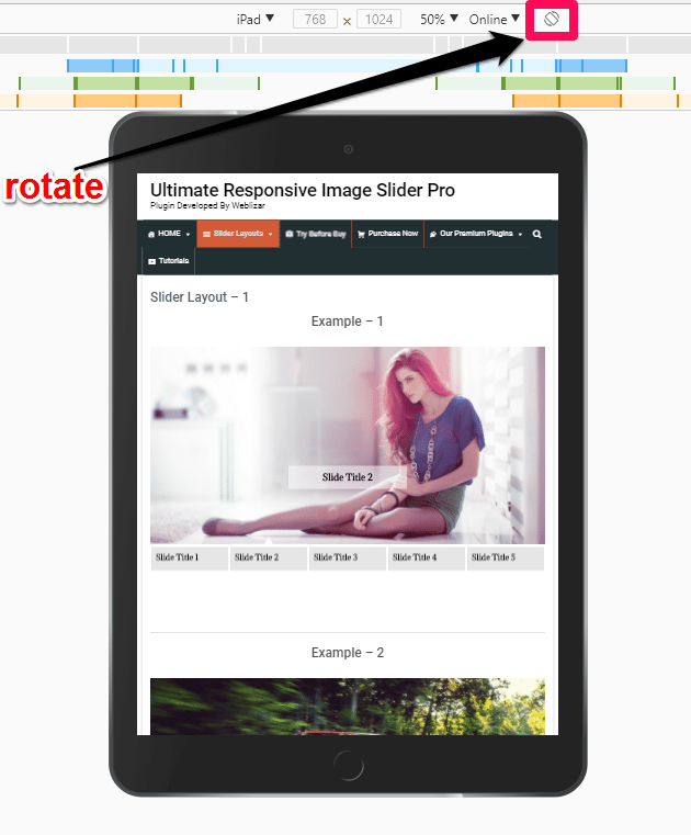
 C) Rotate
You can view easily and test your web design look in Portrait or Landscape mode.
you can see in the screenshot below.
Which Tool Should You Use?
Many of these responsive design testing tools work pretty much the same way, so picking one over another is just about personal preference.
Fabulous and recommended responsive web design tester extension for Google Chrome.
Also Check: What is responsive web design? How to check responsiveness?
Viewport Resizer
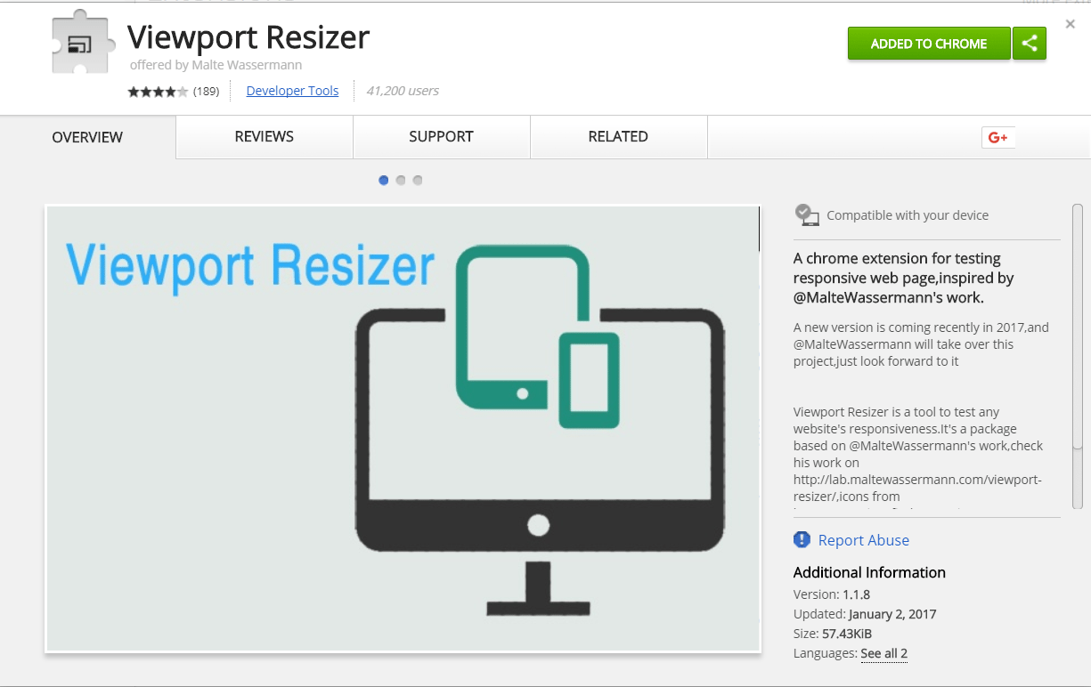
This useful bookmarklet simply lets you resize your browser to a specific dimension, e.g. the dimension of an iPhone 5, Amazon Kindle Fire, or any one of Viewport Resizer’s 47 screen size presets. Top Responsive Web design testing tools In Google Chrome.
Screenfly
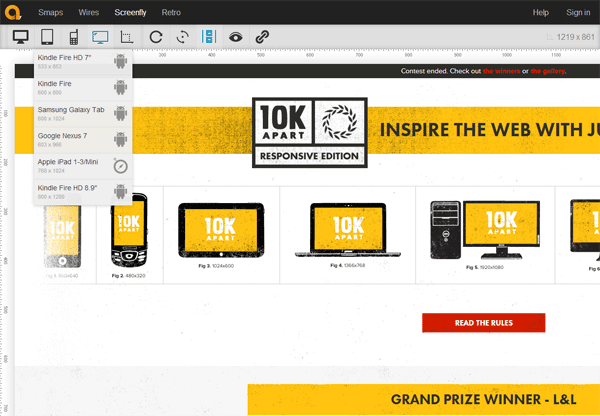
Just like some of the other tools in this list, Screenfly takes in any URL and then gives you a preview of the webpage under various preset screen dimensions.
More tools for responsive web design testing :
- http://responsivedesignchecker.com/
- http://lab.maltewassermann.com/viewport-resizer/
- http://beta.screenqueri.es/
Conclusion – Top Responsive Web Design Testing Tools
Responsive design testing has its own set of challenges. It requires keen observation and the implementation of multiple test strategies. However, with the introduction of various testing tools and emulators, the responsive design testing process has been simplified to a certain extent. Regardless of improvements, developers and testers must constantly interact and exchange ideas during the development and testing phase, allowing them to create and deliver better results in a significantly shorter period, and learn more.
FAQs”
How to test responsive design in Chrome?
To test responsive design in Chrome, you can use the built-in developer tools. Open the website you want to test, right-click, and select "Inspect" or press Ctrl+Shift+I (Windows/Linux) or Cmd+Option+I (Mac). In the top-left corner of the developer tools, click the device icon (Toggle device toolbar). This activates the responsive design mode, allowing you to simulate different devices and screen sizes. You can also drag the edges of the viewport to see how the website responds to various dimensions. This helps ensure your design adapts effectively to different screen sizes.
How to test responsive web design?
One of the quickest and easiest website responsiveness tests is available directly in your browser if you're using Chrome. As well as allowing you to inspect code, the Chrome Inspect tool allows you to virtually view a site on different screen sizes. Just right-click a website and click 'Inspect'.
What is responsive testing of web application?
Responsive testing involves how a website or web application looks and behaves on different devices, screen sizes, and resolutions. The goal of responsive testing is to ensure that the website or web application can be used effectively on various devices, including desktops, laptops, tablets, and smartphones.
school management


Leave a Reply