

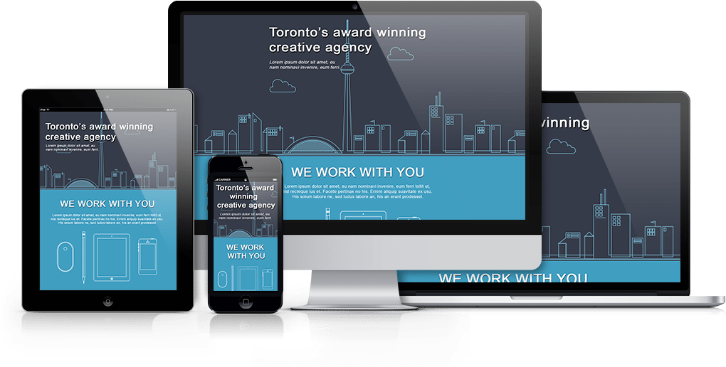
Web design responsive layout has become the most important part over the last few years. Google already announced that Responsive Website is a must-have feature for any business for ranking & promotion in Google. Responsive web design provides a great user experience of a single site in various devices & screen sizes. Here we will discuss Top Responsive Web Designing Platforms in 2018.
1. Bootstrap

Bootstrap is the world’s most popular framework for building responsive, mobile-first sites.it makes front-end web development faster and easier. It’s made for folks of all skill levels, devices of all shapes, and projects of all sizes.it easily and efficiently scales your websites and applications with a single code base, from phones to tablets to desktops with CSS media queries.With Bootstrap, you get extensive and beautiful documentation for common HTML elements, dozens of custom HTML and CSS components, and awesome jQuery plugins.
2. Foundation
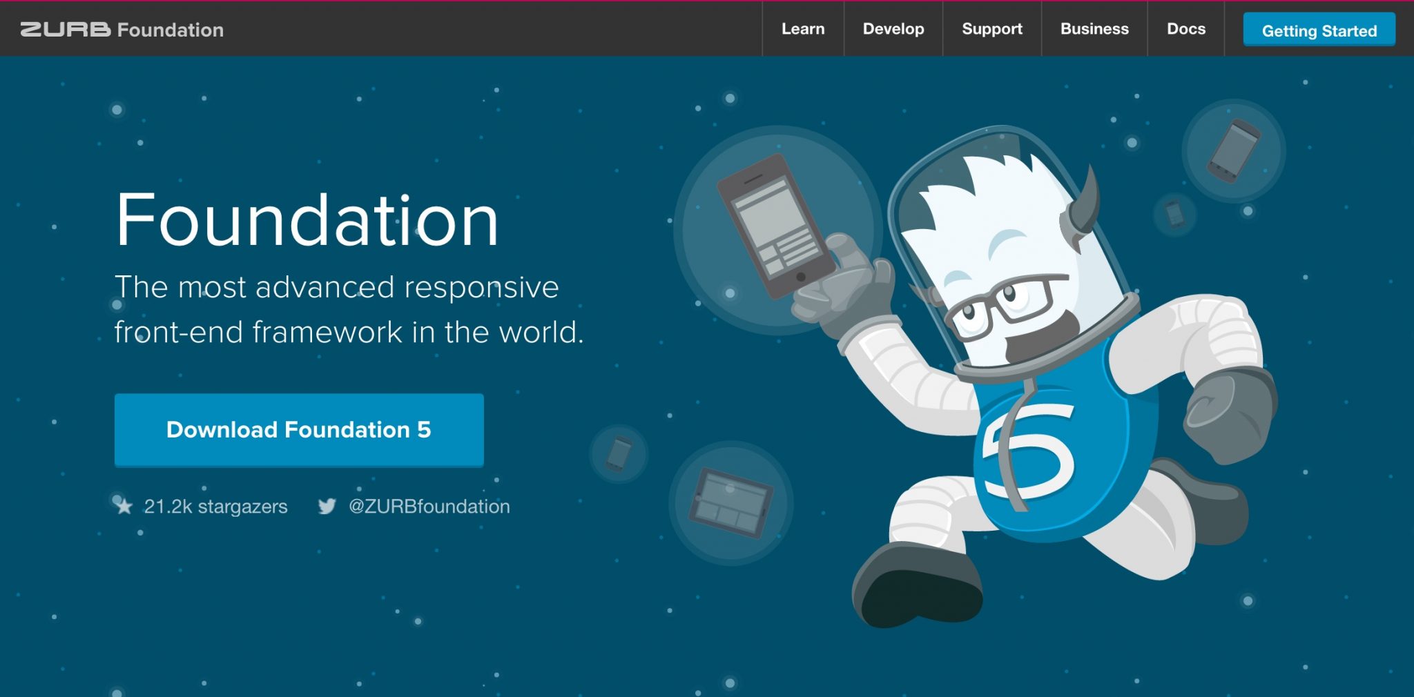

It is Framework for any device, medium, and accessibility. Foundation is a family of responsive front-end frameworks that make it easy to design beautiful responsive websites, apps, and emails that look amazing on any device. Foundation is semantic, readable, flexible, and completely customizable. It constantly adding new resources and code snippets, including these handy HTML templates to help get you started!
Suggested Post: Designer’s Guide to Building Websites More Efficiently with WordPress
3. Gumby
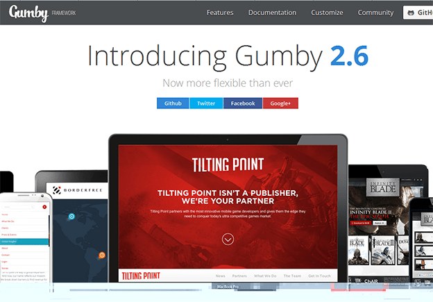

Gumby Framework is a flexible, responsive CSS Framework, Powered by SASS. Create rapid and logical page layout and app prototypes with a flexible and responsive grid system and UI kit.
Gumby2 has a plenty of features, tools & plugins for grids, forms, intuitive UI kit, buttons, navigation, toggles & switches, fancy tiles, shuffle, responsive images, dropdowns, tabs, drawers, and templates.
4. Pure
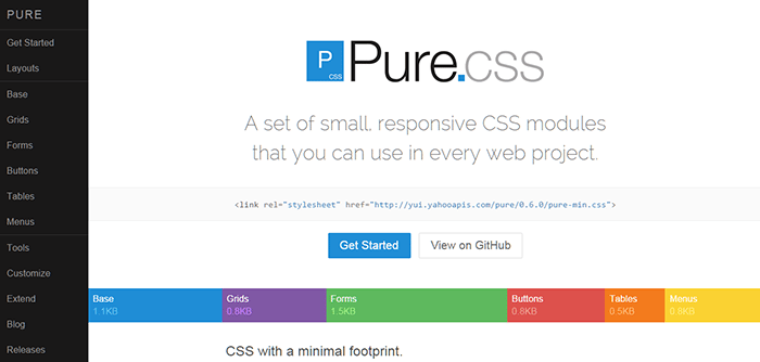

Pure is ridiculously tiny. The entire set of modules clocks in at 3.8KB* minified and gzipped. Crafted with mobile devices in mind, it was important to us to keep our file sizes small, and every line of CSS was carefully considered. If you decide to only use a subset of these modules, you’ll save even more bytes.
It has some cool, smart & attractive layouts for almost everything starting from the blog, email, photo gallery, landing pages, pricing table, responsive side menu, responsive horizontal & vertical menu, scrollbar menu etc. which makes your web design easier & smarter. Moreover, It’s easy to use & customize.
5. Export Kit

Export Kit is a very unique & excellent tool for creating responsive Web & App Layouts from Photoshop, Illustrator or InDesign.it has Quickly Prototype Feature-rich Apps for All Devices and Environments.
With Export Kit you can use any PSD design to generate your HTML5, CSS3, JavaScript, Android UI or WordPress project.
It reduces your lengthy code writing time by generating full source code, also gives you a platform to experiment with your visual layouts & makes your designs more creative.
6. Adobe Edge Reflow
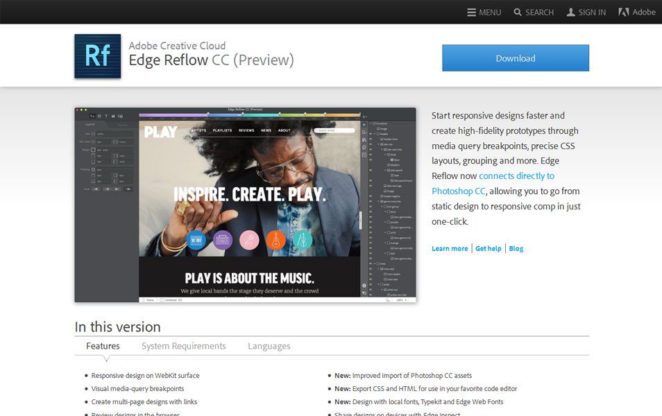

Edge Reflow is a relatively new program from Adobe, having been announced in 2012 and released in February 2013, with the elevator pitch of enabling you to “Design the responsive web” and “Create beautiful responsive designs”. The tricky part is that right now you can’t actually use it directly to create responsive websites, only responsive designs.
It has a lot of features & tools which is cool & attractive.It also has drag & drop option & panels where you can edit your design. If you have knowledge of CSS & HTML then you can create excellent responsive web prototypes with this tool.
Recommended Post: Build Your WordPress Website to Be SEO Friendly
7. Skeleton
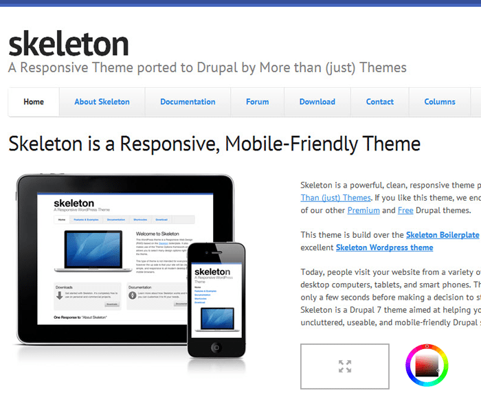

A simple responsive framework for mobile-friendly development. Skeleton Framework takes its roots from dhg/Skeleton and builds upon the same basic principles.
Its strength lies in the fact that it’s a light CSS framework. Coming in just at shy of 400 lines of code. Skeleton is a very lightweight framework for responsive web design & it mainly developed for mobiles ready interface. It’s easier to install & use. For its very lightweight, it can be easily used for various responsive web design projects & mobile platforms without using many resources.
8. UXpin
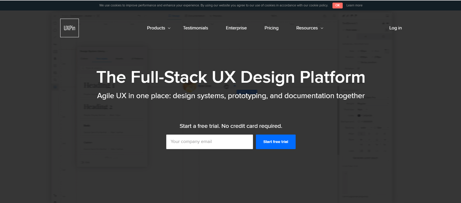

UXpin is a great tool for creating responsive web design prototypes, documents & design systems. It’s a online design tool & app for creating interactive wireframes and prototypes with real time collaboration.
9. Marvel
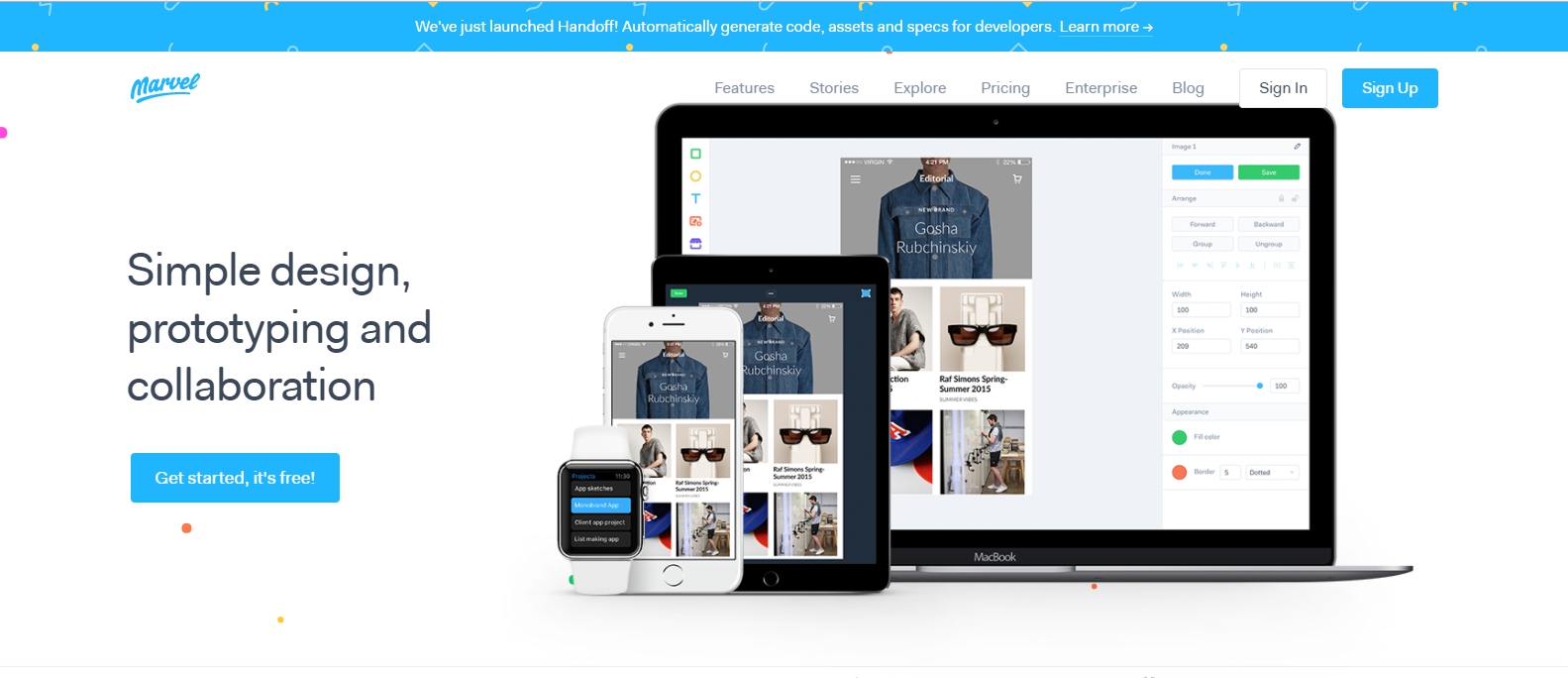

Marvel is an excellent online tool, which allows designers to create prototypes of mobile applications and web projects. It’s a web-based app that takes the need for coding. According to Marvel, their app is the easiest way to turn your sketches, images and mockups into realistic mobile and web prototypes.
This actually far more better option for creating a real kind visual prototype for your Web & App project that is more attractive than the conventional PPT presentation.
10. Semantic UI
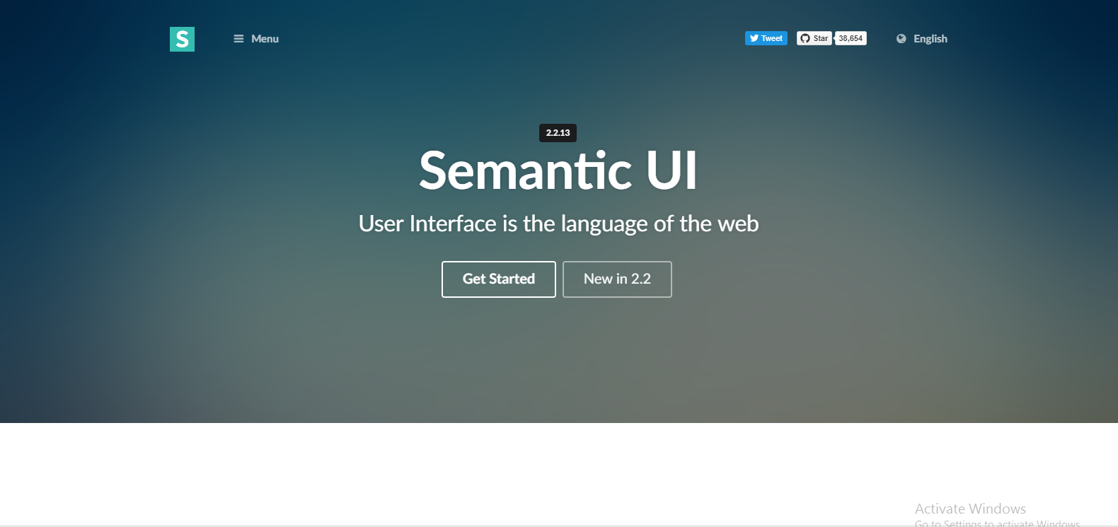

Semantic is a development framework that helps create beautiful, responsive layouts using human-friendly HTML.
it has more than 50 UI components & 3000 plus theming variables for web design & development. Also running code & debugging with this framework is very easy.
Semantic is responsively designed allowing your website to scale on multiple devices. Semantic is production ready and partnered with frameworks such as React, Angular, Meteor, and Ember, which means you can integrate it with any of these frameworks to organize your UI layer alongside your application logic.