As we entered new year, we tried every possible thing to change our online presence in a better way so that it would look good for a newly visiting prospect. No doubt, our websites appearance affects our prospects purchasing decisions. Where we have tried and tested so many things, why not give a fonts facelift to out website so that it will drop that much needed impact onto your site visitor.
Let’s talk about some possible revamps we can do to our site, my suggestion is to start with typography.
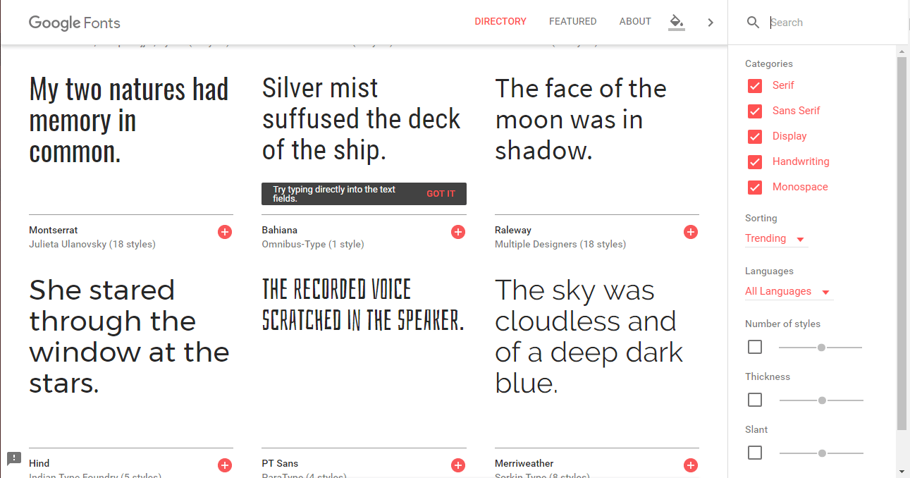
Before even starting any changes to your site, assess what you have currently and most importantly how things are going on in your niche industry. I’ll suggest to analyze some top notch competitors of your niche. Look at the way their site is performing depending on how they have arranged their fonts and typography.
In order to evaluate a website’s typography, ask yourself the following questions:
Are you aware of how your site’s current font selections came about? If your site uses the default fonts from your WordPress theme or they were chosen on a whim, that’s usually a good sign that they need to be changed. While they probably look good enough, they were not hand-selected to fit with your brand’s unique style. Consistency in design is key – from the images you use all the way down to the typography.
Alright, so now after a lot of research and commitment we’ve finally found the best suited fonts those are meshing well with our site and giving a fresh new attractive look to our website. But is it complete? or just a shorter version of what’s going to be launched later. In short, the question that should come into your mind is whether the fonts you’ve selected is complete or not?
If you’re unsure of whether or not you have a complete typeface that includes all letters, numbers, and symbols, go back to the source of the font. There should be a preview field where you can enter custom text. Insert the following lines of text to ensure that all essential characters are present:
ABCDEFGHIJKLMNOPQRSTUVWXYZ
abcdefghijklmnopqrstuvwxyz
àèéïöùüçûæÆœŒ
.,;:?!/[]{}()*-– —…“”‘’_
0123456789
≤≥÷+=≈≠±-·√°@€£$%&*|«»\<>/~”‘§¶©®™/
Mac users, I’d suggest you to download Font Book. Once you’ve digged up the font of your interest, install it in Font Book to test for readability issues. You can use this to:
This also happens to be a great tool for storing your fonts and keeping them organized for the next time you want to give your typography a makeover.
There are some online free tools like Responsinator which makes it much easier to check for responsive compatibility easy. These same responsive checkers can also be used to review your site’s typography for mobile-friendliness.
The standard recommendation for cross-platform font sizing is 16 points or more. That may not be the case if you choose a highly stylized or tightly-kerned font, so be sure to verify that on one of these tools before committing.
You can also use this guide to popular font sizing to give you an idea of where to start with fonts facelift.
Revamping your site with the correct set of fonts and making the size ideal for reader isn’t the only thing to be done.
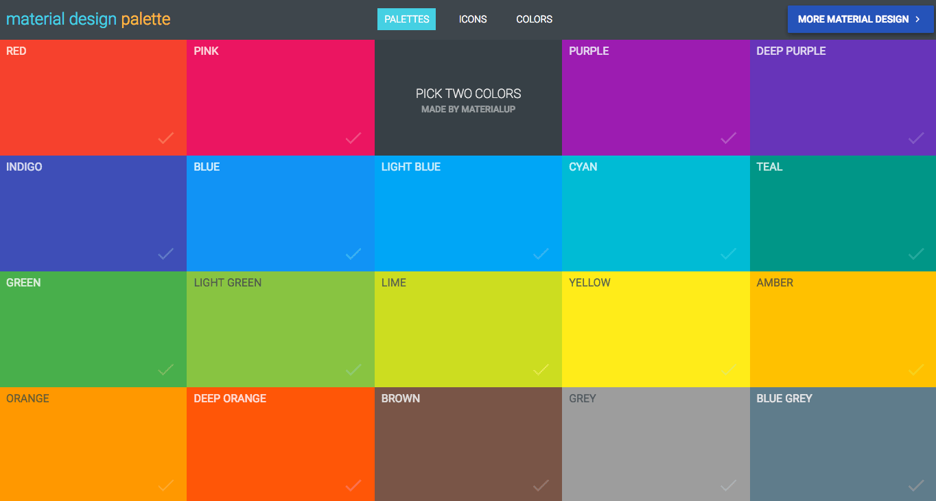
Nope, it’s also about finding the right color. If you haven’t experimented with this Material Design Palette yet, take a moment to do so now. You’ll see that regardless of which branding colors you select, the primary and secondary font color are always black or a shade of grey.
Web developers know all about how to make websites accessible. However, if you’re really looking to give your typography a universal-friendliness in this next iteration, pay closer attention to factors that may affect those who are visually impaired or color blind.
Start by running your website through Color Oracle. This tool will simulate how your website appears to those who are color blind.
You never know who may come to your website, so it’s important to consider these factors now while you’re taking the time to give your typography a facelift.
Font choice is a personal decision, much like everything else in web design. So while I cannot tell you which fonts to use, I still think it’s important to lay out the best practices to follow while doing your research, testing, and implementation of new ones.
Here are the basic rules to follow:
I hope these few fonts facelift tips and tricks will help you out in revamping your site to increase more visitors.
Leave your precious comments below if you are facing any challenges or if you want to add value to this blog post by sharing your experiences.
And yes don’t forget to read How To Use Social SEO To Increase Website Ranking and,
How To Increase Your Facebook Page Post Reach.
If you are web design pro, Top 10 Web Design Trends is for you.
Having a blog is a great thing because you can share anything you want there…
Have you recently built a new website? Are you looking for an SEO guy to…
As a blogger or content marketer everyone dreams about making money by sharing knowledge or…
If you want to increase your traffic and user engagement you must think about how…
In today's speedily changing business community, education is vital. Whether you are expecting to hone…
Data room germany is actually a cloud-based platform which offers secure and specialised storage space…