4 Design Hacks That Will Skyrocket Your Conversion Rates

4 Design Hacks –
You’ve got a great looking site that has won rave reviews from customers and critics alike. Your products are so good that people can’t help but love them. And thanks to your marketing, your traffic keeps climbing every month.
But there is a problem: no one takes any action on your site. Visitors drop by, spend minutes on the site, and leave without so much as giving you their email address.
This is the reality of so many websites today. They might boast impeccable design and stellar marketing, but their conversion rates remain low because of poor design decisions.
In this article, I’ll share 4 design tips you can use right away to skyrocket your conversions, no matter what niche you’re in.
1. Make Your CTAs Stand Out
One of the biggest mistakes you can make in web design is to make your CTAs blend into the rest of your site. If the CTA doesn’t virtually scream “click me!”, your visitors will ignore it.
The trick is to make a CTA that stands out without being distracting. It should be obvious to any user that the CTA is clickable. It should also be placed in a highly visible, high cursor traffic area on the page.
Here are some things you can do to make your CTAs pop:
- Contrasting colors: Pick a CTA color that contrasts against the dominant color scheme of your web page. If your site color is blue, for instance, pick an orange CTA. Since this color is directly opposite blue on the color wheel, it will stand out on a page.
- Effects: Add subtle effects and elements to the CTA to make it pop. Placing a border, adding an icon, or using a shadow effect can make it clear to visitors that the CTA is clickable. Your goal is to make the CTA appear different from other elements on the page.
- Placement: Users shouldn’t have to struggle to find your CTA. Place them in high cursor traffic or high visibility areas of the page, such as above the fold or the navigation menu.
- Size: Larger elements on any page attract our attention. Make your CTA slightly larger than non-clickable elements. If you have two buttons side by side and want to emphasize one, make it larger in size.
Be careful with making the CTA too prominent. That can make it appear spammy (remember those gigantic ‘download’ buttons on torrent websites?) and discourage clicks.
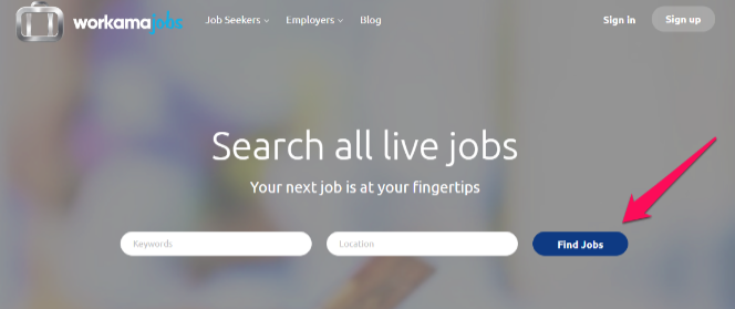
For example, this CTA on Workamajobs uses a blue color and is placed in a high visibility area of the page. Notice how it contrasts against the gray of the “sign-up” CTA:
2. Make Better Use of Colors
Think of the Coca-Cola brand. Can you visualize it without its familiar bright red color? Do you think the brand would have the same punch if it was blue?
Non-designers don’t always realize it, but color plays a massive role in branding and conversion rate optimization. Different colors evoke different emotions in people. Blue is the color of the sky and has a calming effect on people. It is also a “serious” color. When you ask people to make things “bright” color, they’ll seldom choose blue.
(Which is why so many enterprise companies use blue in their logos – IBM, GE, Samsung, AT&T, WalMart, etc.)
Your goal should be to align your choice of color with your brand. Don’t pick a dull color for a youthful brand. And don’t pick bright pink if you’re competing against enterprise B2B companies.
Here’s a quick guide of the qualities we associate with different colors:
- Red is the color of passion, energy, and youth. You’ll frequently find it used in youthful brands, especially in food companies. Examples include Kelloggs, Coca-Cola, Nintendo.
- Pink is a feminine color and is associated with love, calmness, and caring. Brands that use it frequently cater to women, such as Cosmopolitan, Victoria’s Secret, etc.
- Green is the color of plants and thus, is associated with growth, restoration, and the environment. You’ll find that it is often used by brands that want to associate themselves with “restoration”, such as Holiday Inn, Starbucks, The Body Shop, etc.
- Yellow is a bright, energetic, and joyful color. You associate it with the sun. Brands that use yellow have an energetic vibe. Think of McDonald’s golden arches or the prancing horse of Ferrari.
- Orange like yellow is a color associated with warmth and optimism. Think of brands like Harley Davidson, Fanta, and Nickelodeon.
Selecting the right colors for your brand can take a lot of thought and contemplation. There are many different color combinations that can be used, like the monochromatic, complementary color scheme, or triadic. Often you will start with the main color, like green, that you prefer and build your color scheme from that. If you need a little assistance in selecting your brand color palette, there are helpful tools that you can use, like this one created by Bold Web Design. It displays all of the fortune 500 color palettes, including their secondary and primary colors.
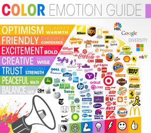
Refer to this image for a quick overview of color psychology and how brands use it:
3. Add Multiple Ways to Opt-In
Collecting emails but have just one “subscribe” button on your web page?
Then you’re seriously missing a trick.
Collecting subscribers, opt-ins, and other useful info is as much about repetition as it is about design. When people see something repeated throughout your website, they’re likely to think it is important.
Analyze how you’re using opt-in forms currently. Make a list of every position where the form shows up. If it is less than thrice, you’re not repeating the form enough.
Here are some places where you should add your form:
- On website load as a welcome mat/pre-roll
- Above the navigation menu as a top bar
- In the navigation menu
- On the homepage in the hero image section
- On top of, within, and at the bottom of content pages
- In the footer
- In a pop-up
Pick any three-four locations and use your opt-in form there. While you do run the risk of annoying some users, the increase in conversion rates is usually worth it.
4. Use Social Proof
You’re traveling through a new city and need to eat breakfast. As you’re driving, you spot two breakfast cafes. The first has a long line of people outside it. The other looks more deserted than the Sahara.
Which one do you go to?
The first one, of course.
Human beings look to social cues to determine whether something is worth their time. A restaurant, business or brand that is well-loved by others (or at least perceived to be well-loved by others) is seen as having the higher value.
In the case of low-information purchases (i.e. where the buyer doesn’t know much about the product, nor cares to know more), social proof becomes a powerful way to evaluate offers. Anything that appears to be popular will draw your attention.
Try to add social proof on your website by:
- Sharing testimonials from customers. The higher the authority of the customer, the more powerful the testimonial will be (i.e. a celebrity testimonial carries more weight than one from a regular user).
- Adding reviews and ratings to products (like Amazon). The more ratings and reviews, the stronger the “social proof”.
- Use social proof from authority by showing a list of authoritative websites you’ve been published in or awards you’ve received.
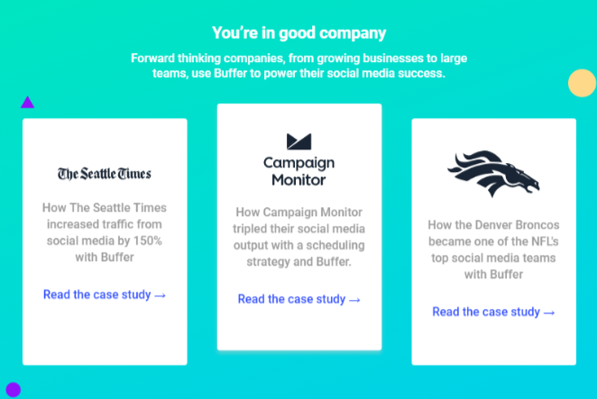
For example, Buffer shows a list of prestigious customers on its homepage. This acts as strong social proof since Buffer’s customers are likely to respect these organizations:
Over to You
The design isn’t just about making things look good; it is also about meeting a website’s business goals. While plenty of designers can create smashing designs, increasing conversions remains a challenge.
Use these four design hacks to get more out of your website. By using social proof, adding more opt-ins, and improving your CTAs, you’ll skyrocket your conversion rates.
school management


Leave a Reply