How to Create a Conversion Friendly Landing Page
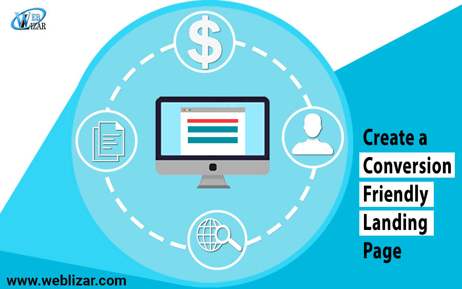
Create Conversion-Friendly Landing Page are essential for every online business. From a marketing perspective, any page that’s designed to achieve a particular goal is a landing page. The goal can be anything from making a user subscribe to your newsletter to selling a product.
The design of a landing page depends on its goal. But in general, any landing page should have the following three parts:
- Headline
- Offer description
- Call-to-action
The headline states your offer. The description contains the details. And the call-to-action prompts the user to click and take the offer. To create a conversion friendly landing page, you need to optimize all these three elements.
-
Write a catchy headline
The headline is the first thing people read when they come to your landing page. It should summarize the main point of your offer. Remember, the main point of an offer is not about its features but its benefits.
Here are four headline patterns that work very well for landing pages.
-
Highlight how your offer solves a pain point of the customer
Example:
“Build Your Brand. Sell More Stuff.” (MailChimp)
MailChimp is an email marketing automation platform. Their landing page headline mentions the very two things that their potential customers want to do. No wonder they get a lot of sign-ups from this page.
-
Use testimonials or talk about your customer base
Example:
“WordPress powers 30% of the internet.” (WordPress)
Anyone reading this headline will get hooked. A CMS that powers almost one-third of the internet is definitely worth a try.
-
Write “How to …” headlines
Example:
“Learn this simple tactic I used to rank #1 for online marketing” (Neil Patel)This is the headline for the newsletter sign-up page of Neil Patel, the well-known online marketer. This type of headlines is perfect for collecting email addresses of your potential customers.
-
Use a cliffhanger
Example:“When eBay, Disney, and Marriott need SEO help, here’s what they do …” (SEOMoz)
This was the headline for the SEOMoz landing page. After reading this headline anyone will be naturally interested to know what they have to say. Cliffhangers take advantage of people’s curiosity. So use them with care.
-
Provide an excellent offer
After getting the primary attention of your visitors through a catchy headline, it’s time to show them what you have in store. If you want to collect their emails, offer them downloadable resources. If you want them to sign up for your newsletter, describe why your newsletter is an essential source of information. In short focus on how your offers will benefit them.
-
Add a clear call-to-action
The main target of a landing page is to make visitors click on your call-to-action button. It must be very clear and easy to identify. Tailor the text of your call-to-action buttons based on your offer type.
Example:
Suppose you are a web development company and you have a page targeting web design Melbourne. What type of call-to-action button should you have?
Well, first of all, you need to understand the intent of your audience. Most of them are potential customers looking for web design agencies. They will want to know your work better before contacting you for a project. So your primary call-to-action button should be designed to take them to your portfolio. The button text can be – “View Our Work” or “Explore Our Projects”.
Making your landing page perfect
Apart from the basic three elements that we have described above, there are many other aspects of a landing page that makes it conversion friendly. Here are some additional tips that will help you fine-tune your landing page:
- Use attention-grabbing images: People may miss your headline or CTA. But they hardly miss an eye-catching image. Images can be a very powerful tool to convert your visitors. Make sure the ones you use on your landing page are closely related to your offer. Avoid typical stock images at all cost.
- Add videos if possible: Videos will dramatically increase your conversion rate. Make videos that describe the service you are offering and how it’s going to help your potential customers. This is a surefire way to increase the engagement time for your landing page. And as the engagement increases, so will conversion.
- Make your landing page dynamic:
Dynamic content is one of the advanced ways to convert people. You can make your landing page show tailored copies based on the location of the viewer. You may also personalize page contents based on the age, gender, previous purchase history etc. a customer. - Add trust signals: Testimonials from previous customers, industry certifications, media mentions, logos of your big clients etc. increase the trustworthiness of your landing page. Use these trust signals so that your visitors don’t hesitate to share their email address or download a file from your site.
- Test and optimize: No one can design a perfect landing page at the first try. You need to test with different elements to find out what is working best for your business. After using a landing page for a while, change things like images, headlines, CTA buttons, color theme etc. to see if you get even more conversions. This type of testing is called A/B testing. It’s essential to test different variations of any landing page.
Conclusion
Now you know the key elements of a conversion friendly landing page. One of the things that we haven’t mentioned so far is SEO. No matter how optimize your landing page is, if it doesn’t rank high in search results you won’t be getting any conversion. So don’t forget to make sure that your landing page follows the SEO best practices.
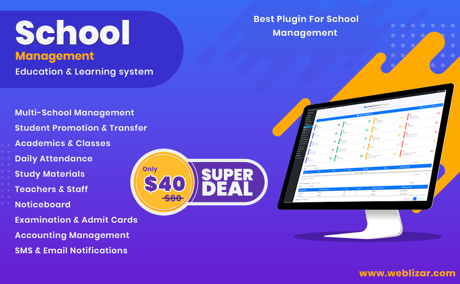
school management
Leave a Reply