


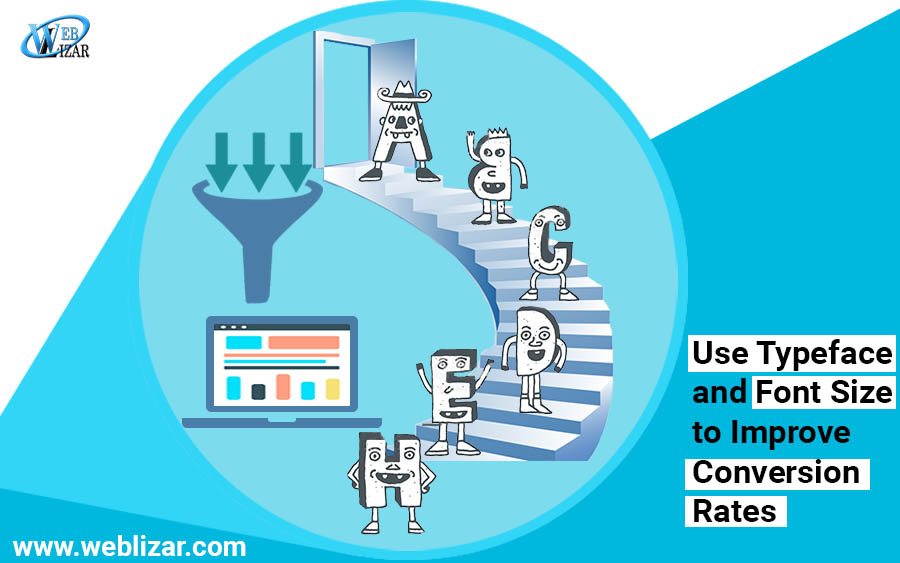
The typeface is one of the most underrated features that designers often neglect when designing a website. A good designer knows the importance of typography and the impact that it has on the viewer. Studies have shown that the sort of typography you choose has the power to either enhance or decrease the user experience and viewer’s mood. If the visitor finds your content too hard to read or unappealing they is likely to abandon the site; which in turn will decrease your conversion rates. An ideal font choice can improve the user experience, and it also has the capability to reflect your business’s vision as well as goals. The aim should not only be to create a website with quality content but to create one with visually appealing, quality content.
How to choose the perfect font and mistakes that should be avoided:
Selecting a suitable typography choice includes selecting the correct font type, the right size of font, ideal color, line spacing and kerning. Although typography may seem irrelevant compared to other aspects of website designing, however, it plays a key role in increasing the conversion rates. There are certain considerations that should be kept in mind when deciding on a suitable typography.
Related Post: Give Your Site A Fonts Facelift
- Pick a Font for the Targeted Audience, and One that Represents your Brand Identity
If you are new to the concept of fonts you probably believe that fonts like Calibri, Arial etc. are designed for a specific context. You need to start thinking outside the box and move on to selecting the font based on your targeted audience and your brand identity. Every font has its own personality. Are your targeted audience Millennials or are you trying to approach a bit more mature generation category? Is your site being developed for a specific gender? Does the font go with the type of business you conduct? These are the sort of questions you need to ask yourself before committing to a font.
- Modern/Contemporary Font
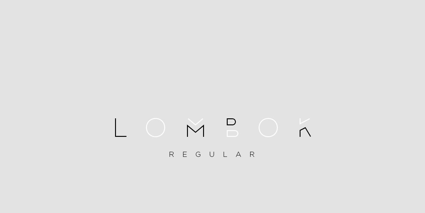
These fonts usually have a minimalistic and neat design. Their beauty lies in their simplicity. The characters are often either very thin or bold, such as Lombok.
Download it at Behance.
Related Post: How To Customize WordPress Site By Adding Custom CSS
- Traditional Font
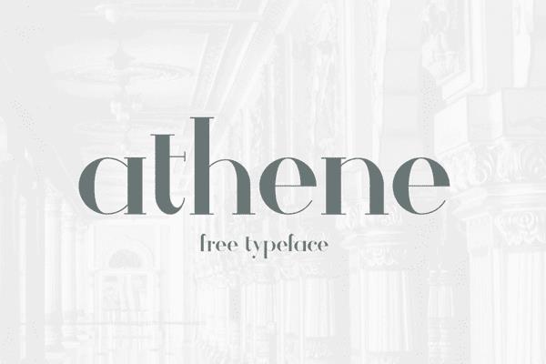
These fonts give off a more traditional vibe as they have been around for quite some time. They signify comfort and reliability, as represented by the fonts Georgia, new times roman etc. If you want your website to have an old-fashioned and classic personality, these are the fonts that you should opt for. Fonts such as Athene and Barbaro can also serve the purpose.
Download Athens at Behance.
Download Barbaro at 1001Fonts.
- Sophistication and Grace

Fonts that usually have a lot of arches and curves are often used for beauty or romantic related websites. For example, the Castro script gives off a romantic vibe, whereas fonts such as Vanity are perfect for creating beauty related websites.
Download Athens at Dribble.
- Bold Fonts
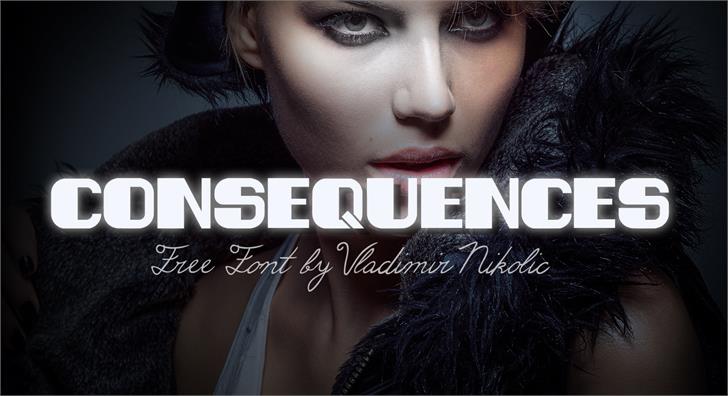
Well-defined fonts with strong and bold characters are generally used to make a bold statement and instantly grab the user’s eye. Some good examples include fonts like Consequences and Nevis.
Download Consequences at Fontspace.
Download Nevis at Fontspace.
- Personalized Fonts
You can always opt for a customized font, specifically created to truly capture the essence of your company. It will help you create your very own distinctive brand identity.
- Readability
The objective of your website should be to get through to your customers via your content, but that might be hard to do if your content is not readable. If the content of your website is too hard to read, visitors are more likely to leave your page. This can contribute to higher bounce rates and decrease in conversion rates. Certain factors which affect the readability of content are listed below:
- Design
While creative fonts can add energy to your website, still it must be never overdone. You should not make the font so extravagant that it becomes near impossible to decipher. Sometimes less is more; so don’t over complicate matters by making the content too hard to read for your visitors. Never compromise on readability!
Using fonts of one too many designs will create a clutter, and give off an untidy look. Try to avoid this mistake as it can create confusion for the visitor and contribute to an overall negative impression. Stick to one or a few fonts when creating a website.
- Size
Something potentially as insignificant as font size can still have a huge part in accurately representing your brand’s vision and identity to the site visitors. The font size to be implemented should neither be too small, so as to avoid putting a strain on your viewer’s eyes nor too big that it takes up the majority of your page area. You are more likely to have a better platform for interaction with your visitors if the font size is readable. Moreover, they will be better equipped to understand your message. In this day and age, people access the internet through a variety of devices (smartphones, laptops, tablets etc.). So, you need to pick a font size that is compatible across different interfaces.
- Importance of line Spacing and Kerning
Factors such as line spacing and kerning help the viewer perceive the approximate length of the content. If the content appears too long or it is too much of a hassle to read, the visitor is most likely to leave the page. Furthermore, if the space between characters or the lines is either too wide or not enough, the user might face difficulty in reading the article. Kerning and line spacing need to be equal to every line/character; otherwise, your website might have an unprofessional feel to it.
Related Post: Few Ways To Make Your Site Easily Accessible
- Color Scheme
When choosing the color scheme, you need to bring into consideration to the targeted audience and their preferences. Think about the targeted age group, gender as well as niche; then select your color scheme accordingly. Studies have shown that females usually prefer light sober colors while males are drawn towards brighter and darker colors. Depending on these (and other similar) factors, pick a suitable color for your font. You need to pick a dominant color for your brand logo and some other colors for the website that compliment your dominant color.
Adding color can truly brighten up your website, but you must never add too many colors so that it becomes an indistinguishable mess of bright hues. The colors should be harmony with each other rather than creating a clutter. This is where white space steps can again prove advantageous. White spacing is a crucial aspect that often not given its due share of importance. If done correctly, it can increase the overall readability and adds finesse to your website.
Conclusion
Focusing on tiny details such as font, its size and color may seem like a waste of time as well as resources, but it is sure to pay up by increasing your conversion rates. Every typeface has its very own personality and every color tells a different story. Together they have the ability to impact the viewer’s mood and emotion. Hence, it is a way of converting a random visitor into a potential client with minimalistic effort.