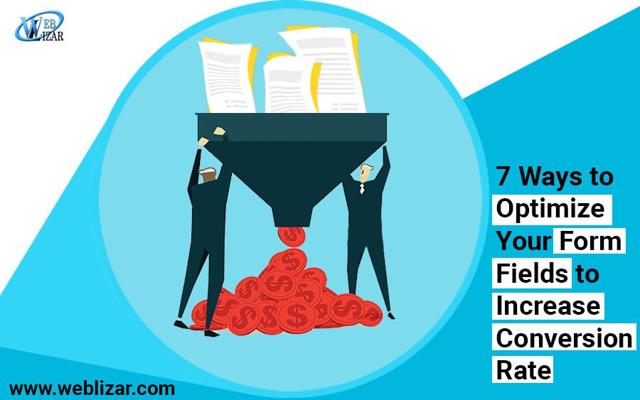
7 Ways to Optimize Your Form Fields to Increase Conversion Rate
- Digital Marketing
- contact form optimization, CRO tips and tricks, form field optimization, how to optimize forms, increase conversion rate
At the core of every successful eCommerce sales funnel, lies a web form. A web form that is highly optimized and carefully crafted can take control over the buying process and acts as a catalyst to speed up the conversion process by capturing high quality leads from your website.
Let’s face it guys; nobody likes filling out forms. Whether it’s an exhilarating gym admission form or a stereotypical bank account opening form, forms are hated universally. For customers, forms are nothing but a piece of paper, but for marketers, it is a substantial tool for capturing valuable information about potential customers. A duly filled form is a vital key to success and something that is worth pure gold.
Why Do Forms Matter So Much?
The importance of web forms is no secret for e-commerce entrepreneurs and marketers. In fact, most of the marketers admit to the fact that well worked out forms can increase sales at minimal cost. However, most of the brands fail to optimize their forms for usability. The reason is that they fail to spot the opportunities for optimization and thus experience an increase in bounce rates.
In this article, we are going to highlight 7 overlooked opportunities to optimize your form fields to increase conversions.
- Secure Your Website With HTTPS
The first and foremost reason why people hesitate to fill out forms is that of the fear of being spammed. Especially when you ask for customer’s email address, they get uncomfortable as we know that one wrong sign up can fill your inbox with more spam emails than genuine. Most of the time these emails offer dubious offers as financial services, or one may even receive invitations to pornographic websites.
Suggested Post: Migrating From HTTP To HTTPS – Infographics
If you want to get the information from customers, you must build a strong reputation so that your customers trust you. The first thing you need to do is to secure your website with HTTPS. If your website is not HTTPS secured, chrome will categorically label your website “not secure” warning users not to communicate with you. HTTPS deploys one or two secure protocols to encrypt communications, so that customer’s information and logins remain protected from the perverts and spammers.
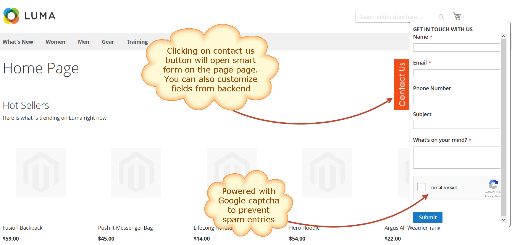
- Secure the web Forms with Google ReCaptcha
Previously websites used Captcha to prevent web forms from spam abuse. Captcha is a hard puzzle and users most often find it difficult to solve and thus abandon the web forms. Thanks to Google for rolling out a new API that radically simplifies the reCAPTCHA experience. There are a lot of web forms available for Magento, Woocommerce, and Shopify that are powered by Google reCaptcha. In the image below is an example of Magento contact form that has deployed Google reCaptcha and the user can verify only by a click.
- Simplify and Remove Friction
The web form philosophy must be based on minimalism; the idea that “less is more” is what you should continuously put tintopractice while designing the user interface of forms. Keep your forms as short as possible and never ask for information the user think you don’t need. The people on the internet are less patient and more demanding.
This is the major reason why customers often leave the store without purchasing because the checkout lines are too long. Similarly, a long contact form can scare your potential customers as his motive to fill the form is to make his life easy, not more difficult. Neil Patel reveals that he was able to increase conversions by 26% by removing just 1 field from his contact form.
There are hundreds of ways to minimize this friction. One way is to add a flexible extension to your store that allows you to interact with customers by customizing form fields as per your needs. For instance, if your e-commerce is the platform is Magento, there are tons of interactive extensions such as Magento customer attributes that allows you to add custom fields to registration and accounts pages. This provides an opportunity to add relevant fields in the form and thus make it more simple and easy for customers.
- Use Smart Web Forms
Another reason why users abandon a form is that of the common fields they encounter over and over appearing on several forms you offer. If your website is providing multiple forms then you must not ask for particular information more than once; otherwise, the users are bound to get frustrated.
Thanks to developers, there are several tools available that will empower you to hide fields that users have already filled on rest of the forms. These forms use conditional logic based on customer’s history of submissions and thus eliminate the fields filled in previously. This will unburden your users from the excess of form fields.
- Offer Rewards
A visitor will only fill forms if he thinks it’s worth his time. A great way to increase form submission is to offer something in return. It can be anything of significant value such as a discount on a particular product. Offering rewards can cost you a bit but are something of bigger value. You can not only increase the subscription rate but can also earn brand loyalty.
- Clear Call to Actions
Call to actions compels customers to do what you want them to do. A clear call to action acts as a bridge and persuades your visitors to complete the forms. Marketers often fail to optimize CTA on web forms and web pages, and that is the reason why they fail to turn traffic into conversions.
Recommended Post: 7 Things You Can Do To Fix Why Your Website Isn’t Generating Leads
Engineering Clear Call to Actions on Web Forms is pure art. From color to placement to the shape of your call to action, optimizing minute details can speed up the sign-up process. Exit CTAs have also emerged as one of the effective ways of lead generation. It keeps your visitor engaged and only appears when a user is about to leave your website, so they feel less annoying to users. A well-designed exit pop-up detects your users’ behavior and serves as a fantastic way of getting your reader’s attention.
For example, UGMONK has a great exit CTA, offering users a free UGMONK tee by signing up to enter the giveaway. The “Enter giveaway” Button is perfectly optimized. As the website is primarily for males, the blue color and the symbol “→” is multiplying the power of the call to action button.

- The Trust Elements
Above all, making users fill out your forms is all about trust. The goal of your landing page form is to capture the customer’s personal information, and he will only provide if he feels comfortable. This is why users refrain from Facebook and Twitter sign-ups as they are known for automatically spamming with updates on user activity. So, if you are going to use a Facebook/Twitter sign up, make the users comfortable by assuring that the application won’t post messages and updates automatically for them. Similarly, sometimes users don’t sign up for an account as they fear they won’t be able to delete it afterward. Let them know that they can delete the account anytime they want. These trust elements encourage customers to signup.
Conclusion
So as you see, where people hate to fill forms; there are still ways to achieve it. It all depends on the utilization of opportunities for perfect optimization. And there is lot more you can do to optimize the web forms. However, if you are a beginner at the crossroads deciding what areas to prioritize, these six ways can help you optimize your forms to increase conversions.

Author Bio:
Simon Walker is an experienced eCommerce developer and consults businesses to reach their online goals by creating more and more convenience for the end consumer. With more than 7 years of industry exposure, he is currently working at FMEextensions – a premium Magento web development company. You can get in touch with him on Twitter and Facebook.
school management


Leave a Reply