7 Pro Tips To Create A Balanced Infographic

7 Pro Tips To Create A Balanced Infographic
-
Danish Ansari
3 Comments
- Digital Updates
- how to create an infographic, infographic tips and tricks, pro tips to create infographics, tips to create infographics
Infographics are in action nowadays. According to Hubspot, the number of searches for infographics on Google has tremendously raised over 800%. Infographic generation rate grows by 1% every day.
Companies like to include infographics into their content marketing tactics because they bring compelling results. People who are practicing infographics onto their blog posts and websites are increasing by 12% compared to those who aren’t doing it. Visual content is powerful and consumers find it more engaging than mere text because 65 percent of people are visual learners.
So how do you think you should design your infographic content to captivate your target audience and shout your brand out?
Here are 7 Pro Tips To Create A Balanced Infographic……..
1. Look what’s around
To make sure your infographic stands out and performs excellently, you need to check what has been done so far in that respective field and how it is performing. Check the most popular infographics to see what elements they have in common.
Pinterest is a great place to find out infographics those are already in the market. Make sure you are searching most pinned post (infographics) to get an idea of what people are liking the most.
Another great website is Visual.ly, where you can find attractive infographics distributed under several categories.
While observing the infographics, you should few questions: which of them sends a powerful message and engages users in sharing or commenting? Which of them is most informative? Do they prompt users to take a step and make it easy to do that? These question will allow you to think of a great infographic idea.
2. Think of a great idea !
The basis for your infographic is the idea. One of the most effective techniques used by brands is analogy.
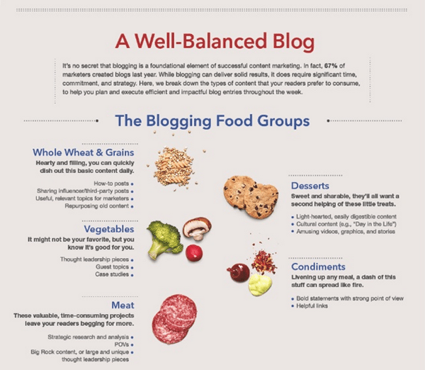
Take a look at this eminent infographic created by LinkedIn Marketing Solutions, which uses a food analogy to show how blogging fuels content creation.
Before setting out to create your infographic, you must set its purpose – is it amusing, shocking or serious? Your main aim should always be to teach and encourage your audience.
3. Ensure your data is authentic
Relevancy of your data and the message you are spreading should be at the top, as well as it should be never seen never heard kind of data and impressive as well. Otherwise, you’re making an infographic about facts everyone can simply learn elsewhere. Make sure the sources you are using are reliable. Fact-checking is an essential procedure to ensure your infographic is accurate.
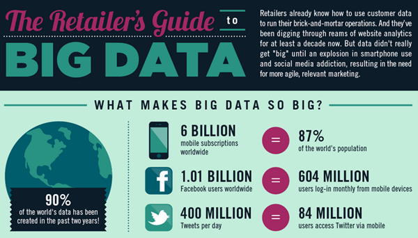
Take a peek at this amazing infographic by Monetate entitled The Retailer’s Guide to Big Data. It’s packed with figures and numbers represented in several graphs that are composed to capture the most important facts for e-commerce big data and display them in the most digestible way.
Always credit your sources.
4. Make it Sweet and Simple
Your style should be easy and logical – restrict yourself from using many fonts, stick to one style for your visual media and follow your color scheme. Make sure your different section have clear visual connections between each other so that your user doesn’t get confused.
We should look at this, Travel Hack’s infographic by Best Hospitality Degrees. Every element of the infographic follows the same style and color scheme, which is composed of just a few colors and shades.
5. Engage user’s with an interesting story
All the facts and figures you have chosen should redirect and back up your main story. It cannot be just a bunch of interesting facts – each and every piece of data should add to the main story.
6. What is the right size?
Website loading time plays an important role in customer engagement and optimization of the site. That’s why it’s a good practice to always use compressed JPEG format to reduce the weight of the infographic. This will ensure that the page loads quickly without making the visitor wait too long.
Another important factor is size. You should go for a width of no more than 735 pixels – otherwise, you will risk your infographic to get re-sized and that can mess up its dimensions. Keeping your width under 735 pixels is important for sharing as well – especially on Pinterest, where 735 pixels is the full width of an expanded image.
The total length of your infographic should be under 5000 pixels. If it’s too long you might lose the attention of your audience.
7. Keep it Optimized for Sharing
As infographics tend to get a lot of traffic to the website, you must embed it in a blog post, optimize it for sharing and of course share it on your own social platforms.
Using a tool like Sumome you can easily optimize it for sharing by placing social media share buttons next to the infographic. This will encourage other visitors to share it.
How to share infographic effectively?
You can start off by creating a special image for Facebook and adding it to your blog post. You can then write an attention-grabbing headline and then begin sharing it to all your social networks.
Always include your website URL, the logo of your company and add links to your social channels in the infographic so that people will always know who created it.
Here’s an example of an effective brand infographic.
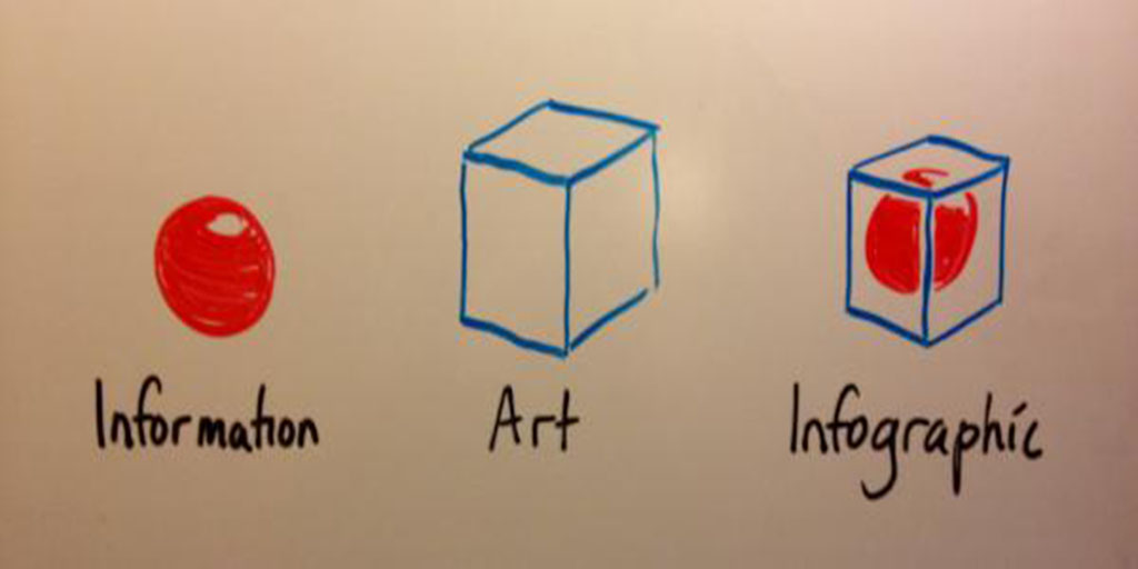
At Last, Infographic Explained Infographically,
Created by Customer Magnetism.
Hope you have enjoyed these 7 pro tips to create a balanced infographic.
Don’t forget to read Top 3 Reasons to Get Green Web Hosting, as this is the future.
Also if you didn’t know about top 10 google services you probably didn’t know, read it here.
Leave a Reply
You must be logged in to post a comment.


3 Comments
Danish Ansari January 5, 2017 at 2:07 am
Thank you for appraising Jessica, keep reading. 😉
jessica January 5, 2017 at 1:17 am
Thank you for the fresh content and information you provide. This really helps learner like me. Keep sharing knowledge. Happy to read.
My Plango July 10, 2017 at 7:48 am
I am a fan of infographic. this can really help me out. Thanks!