Tag Archives: top web designing trends
Top 10 Web Design Trends
-
Danish Ansari
0 Comment
- Themes , WordPress
- top web designing trends, web designing, web designing for 2017, web designing trends
Top 10 Web Design Trends
If you’ll ask me one habit that all successful people carry with themselves, it will be to be updated in their business area. Same goes with web world as if you are doing any business online (who is not?) then you have to maintain your virtual store, business website or your blog up to date according to the running trends those are attracting people. The web is evolving at a rapid pace and new technologies and development techniques are appearing every day and that gave me a chance to talk about top 10 web design trends.
In this blog post, we are going to talk about Top 10 Web Design Trends which are going to take over the web world. The below list which we are going to elaborate in a while isn’t all new as it has some trends those were gaining or maintaining their popularity in the previous year. To stay ahead in the race, make sure every tini tiny bit of your website is trendy.
1. Color
When we design our homes, the color scheme of the walls is definitely a topic to get confused with and needs a lot of discussion and variations. It is not possible for us to paint a new color on the wall and then see whether it is looking good or not but thank god when we are creating our very own website, we have the liberty to try and test and play with the color scheme of our website until we are satisfied with the final output.
According to businessfinder,
- 93% of consumers place color and appearance above other factors when making a buying decision.
- 85% of shoppers state color as the primary factor in their decision to buy a product.
- Brand recognition, which links directly to consumer confidence, is increased by 80% when the right colors are used.
Color choice for a website is incredibly important. It can influence visitors’ emotions, thoughts, and conversion rates. So, what are going to be the color trends for 2017?
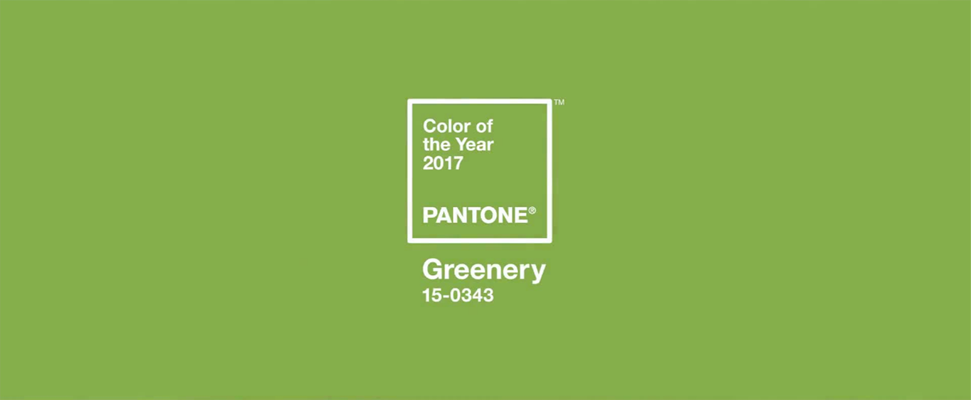
Pantone has unveiled their 2017 color of the year – Greenery. It’s been chosen as a symbol of new beginnings; a refreshing and revitalizing shade.
If you have right set of the color combination on your website, it is more likely for your customers to purchase your product.
2. Retro Is Back With Modern Twist
You never know what can appeal more to your customers and since now everybody is using the internet, we have retro designing with a modern twist. Retro lovers always seek for a pinch of retroism in the new web trends and now that is a real trend where people are mixing it with the modern style web designing to balance it out for a vast number of modern and retro lovers.
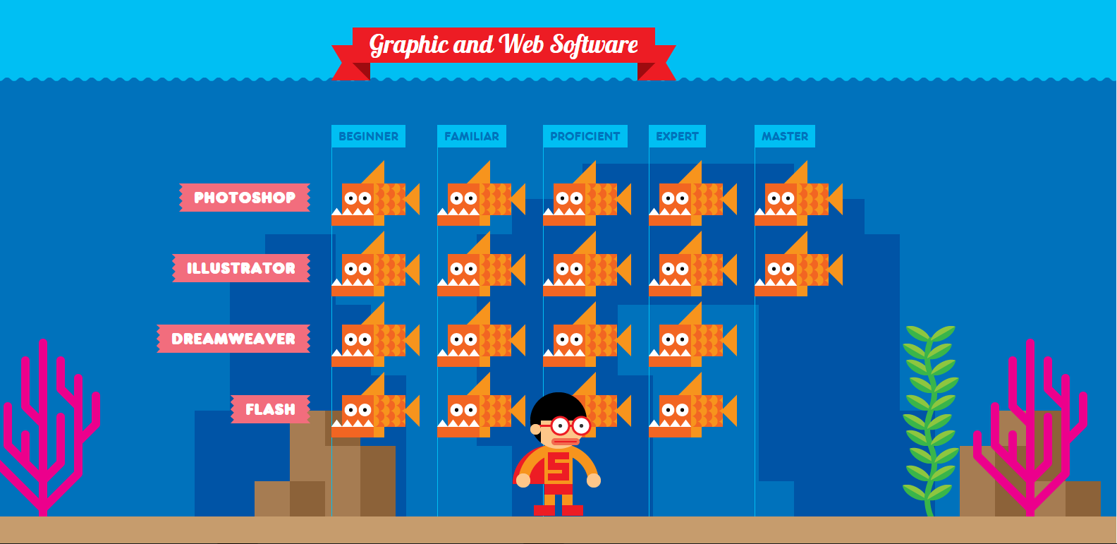
This interactive resume of Robby Leonardi is a brilliant example of modern retro. He has combined a semi/modern pixel art style with the side scrolling of a Super Marioesque video game.
3. Cinemagraphs
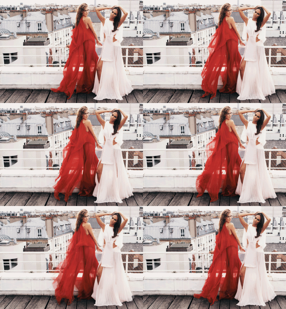
Cinemagraphs, as the name suggests, is a mixture of a photograph and a video. It contains a still image with some repeatedly moving elements that can prove to be an eye catcher as far as marketing your product is considered. They certainly made their spot in top 10 web design trends.
Cinemagraphs can either be GIF files or video. Both can result in rather large file sizes if the cinemagraph is of a high quality. Cinemagraph GIFs can easily be over 3MB, so you might want to consider streaming video instead.
You can check Flixel or Cinemagraphs for some quite astonishing cinemagraphy.
4. Material Design
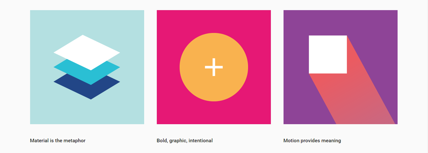
Google’s Material Design has been on the scene since 2014. It is essentially built of on the principle of paper and ink, translating the qualities of these into a digital format. For example, the use of shadows and edges to indicate what you should touch, such as buttons.
In the past couple of years, Material Design has grown in popularity, with numerous themes and templates being created for CMSs as well as front-end frameworks such as Twitter Bootstrap. One negative feedback you will hear for Material Design is that many of the sites built using it seem very similar; perhaps too similar. This is due to adhering too rigidly to the style of Material Design, rather than just applying the principles.
I’m anticipating that we will see many smaller web projects adopting Material Design as-is. Not just the Material Design principles, but the actual style or theme. However, we will likely see a portion of the design community actively going against Material Design, or at least going against the stereotypical style, whilst still implementing the principles.
5. Be Bold And Creative With Your Typography
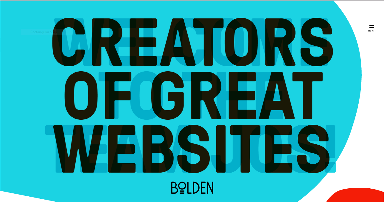
The previous year saw the creative use of typography and 2017 is going to see the advancement by pushing the boundaries of web designing. Expect type to not only take up more space on the screen but also expect to see more creative typefaces than the usual web fonts you are used to.
Bolden did a great job my mixing the colors and implementing bold and much creative font types.
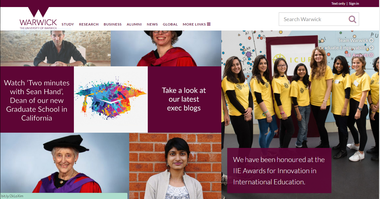
6. Flexible or Modular Design
Implementation of flexible or modular designing in your web layout isn’t a new thing but it has been gaining the popularity among the population. According to some stats, 2011 was the year when people started showing interest in modular designing for their business or product based website and I am anticipating that it will keep on growing this year as well and certainly hold all right to be in the list of top 10 web trends.
Warwick University has also incorporated the modular design approach into their website.
7. SVGs
Are you tired of logos and other images resizing terribly? If so, you should try out SVG files instead of the usual PNG and JPG formats. The SVG format isn’t suited to all images; they’ll only work with vector graphics, so you can’t go and infinitely scale any photos. However, for images like logos, they work brilliantly.
SVGs have been around since 1999, but still, we see the PNG and JPG formats being used for images when SVG would be the more appropriate format. This all seems to be changing though. You’ll likely have seen SVGs being mentioned more and Google Trends data shows that interest in SVGs has been growing year on year since 2013. I am anticipating increased usage of this format in 2017 as well as an increase in articles written on the topic.
Why should you use SVGs? The main reason is that your SVG image should render perfectly no matter what the scale. Also, images in the SVG format tend to have very small file sizes; great for your page speed.
If you want to see an SVG in action, then look no further than the WPMUDEV logo in the top left corner of this page. If you zoom in using your browser, you will see that the logo doesn’t become pixelated, no matter how much you enlarge it. Instead, the WPMUDEV logo remains sharp and of a high quality.
8. Flexbox
Flexbox is a CSS3 layout mode that makes it much more efficient and predictable when working with page layouts that will be displayed using various screen sizes and devices.
Flexbox has been steadily gaining interest, and with it now being supported by all modern browsers, it’s likely more front-end developers will be using it.
9. 360 Videos And Virtual Reality
I am one hundred percent sure that 2017 is going to be the year of VR. Many WordPress theme and plugin makers have already said that it is the future for web designing and they are working on projects like these.
If you aren’t already aware, Google VR View is a JavaScript API that easily allows you to add 360 video experiences to your own website. You can read more about Google’s VR View here.
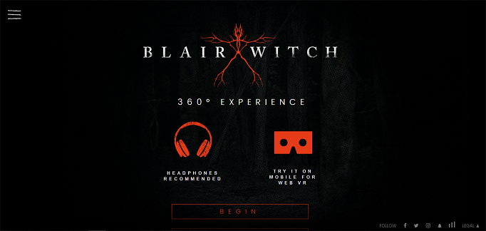
An interactive, 360 web VR experience was created for the new Blair Witch movie. This is best viewed on mobile using a VR headset for your mobile or if you love traveling, Airpano is suitable for you to test.
10. Microinteractions
Microinteractions are single, specific moments when a user is interacting with your website. It doesn’t have to be a website per se, but in our case, it is. These moments could be actions such as liking a post, sending a message or filling in a form field. The purpose of microinteractions during these moments is to provide feedback and guidance for the user, improving UX.
Microinteractions have become increasingly popular, and the ways in which feedback and guidance is provided to users is getting ever more creative. Expect to see much more of this in 2017.
Ending Up
Well, that’s pretty much it. Hopefully, this blog post has introduced you to some new web trends and technologies that you weren’t aware of about.
Be creative while designing your websites but keep it in mind that you are making changes those look appealing to your users, you don’t have to add up unnecessary changes just for the sake it’s trending.
If you haven’t read about Ecommerce Trends For WordPress, Read out loud.
Or WordPress Trends for 2017 or Content Marketing Trends for 2017.
