Give Your Site A Fonts Facelift

As we entered new year, we tried every possible thing to change our online presence in a better way so that it would look good for a newly visiting prospect. No doubt, our websites appearance affects our prospects purchasing decisions. Where we have tried and tested so many things, why not give a fonts facelift to out website so that it will drop that much needed impact onto your site visitor.

Let’s talk about some possible revamps we can do to our site, my suggestion is to start with typography.

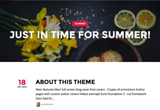
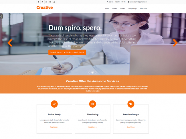
Step 1. How Your WordPress Website’s Current Typography Looks Like?

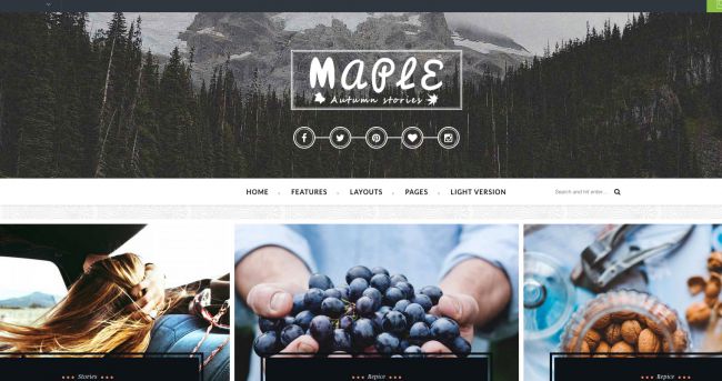
Before even starting any changes to your site, assess what you have currently and most importantly how things are going on in your niche industry. I’ll suggest to analyze some top notch competitors of your niche. Look at the way their site is performing depending on how they have arranged their fonts and typography.

In order to evaluate a website’s typography, ask yourself the following questions:

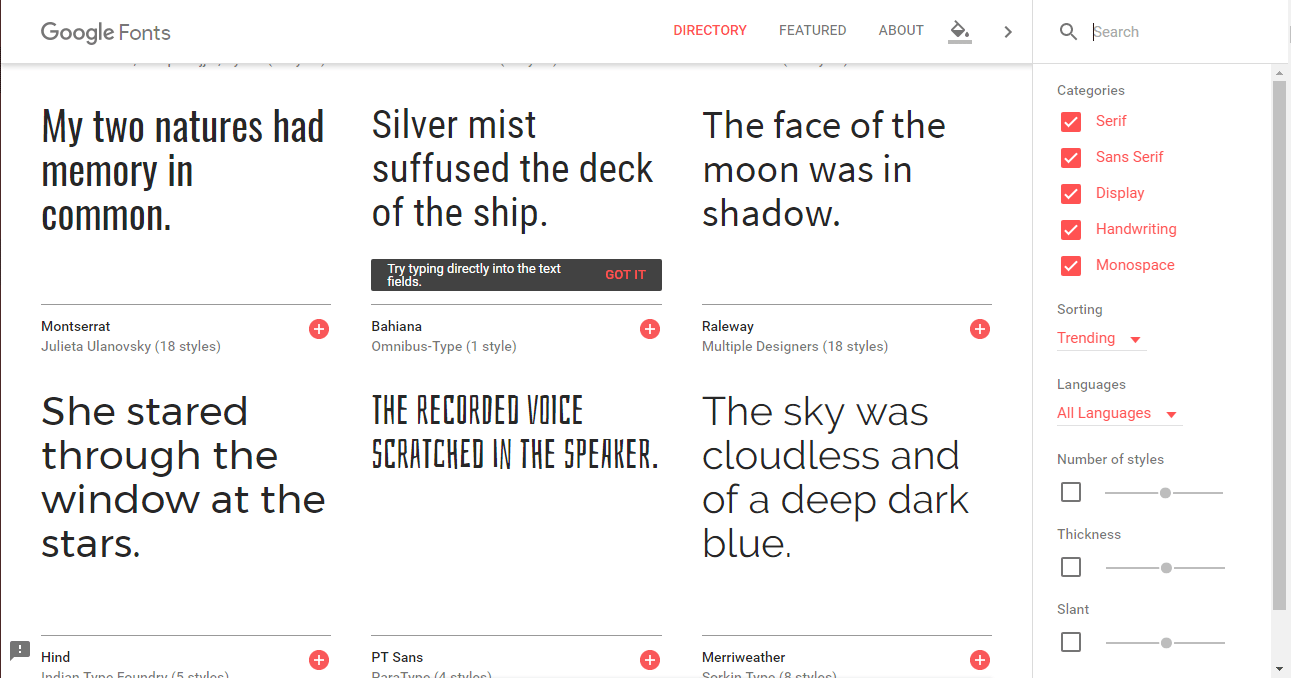
1. From where the current font(s) came?

Are you aware of how your site’s current font selections came about? If your site uses the default fonts from your WordPress theme or they were chosen on a whim, that’s usually a good sign that they need to be changed. While they probably look good enough, they were not hand-selected to fit with your brand’s unique style. Consistency in design is key – from the images you use all the way down to the typography.

google-fonts-new

2. Is your fonts family complete?

Alright, so now after a lot of research and commitment we’ve finally found the best suited fonts those are meshing well with our site and giving a fresh new attractive look to our website. But is it complete? or just a shorter version of what’s going to be launched later. In short, the question that should come into your mind is whether the fonts you’ve selected is complete or not?

If you’re unsure of whether or not you have a complete typeface that includes all letters, numbers, and symbols, go back to the source of the font. There should be a preview field where you can enter custom text. Insert the following lines of text to ensure that all essential characters are present:

ABCDEFGHIJKLMNOPQRSTUVWXYZ
abcdefghijklmnopqrstuvwxyz
àÚéïöĂčĂŒĂ§Ă»ĂŠĂ†Ć“Ć’
.,;:?!/[]{}()*-– —
“”‘’_
0123456789
≀≄÷+=≈≠±-·√°@€£$%&*|«»\<>/~â€â€˜Â§Â¶Â©Âźâ„ą/

3. Are there any readability issues?

Mac users, I’d suggest you to download Font Book. Once you’ve digged up the font of your interest, install it in Font Book to test for readability issues. You can use this to:

  • Check for a complete set (like with test #2 above).
  • Preview the font digitally to get a sense for how it’ll appear on your website.
  • Print the full character set at different sizes and styles to determine which ones are the most reader-friendly.

This also happens to be a great tool for storing your fonts and keeping them organized for the next time you want to give your typography a makeover.

4. How is it look on mobile?

There are some online free tools like Responsinator which makes it much easier to check for responsive compatibility easy. These same responsive checkers can also be used to review your site’s typography for mobile-friendliness.

The standard recommendation for cross-platform font sizing is 16 points or more. That may not be the case if you choose a highly stylized or tightly-kerned font, so be sure to verify that on one of these tools before committing.

You can also use this guide to popular font sizing to give you an idea of where to start with fonts facelift.

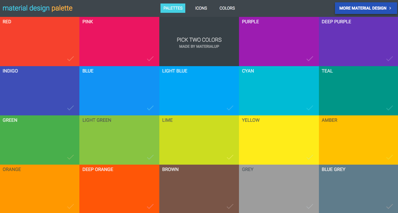
5. Is Your Font Color Reader-Friendly?

Revamping your site with the correct set of fonts and making the size ideal for reader isn’t the only thing to be done.

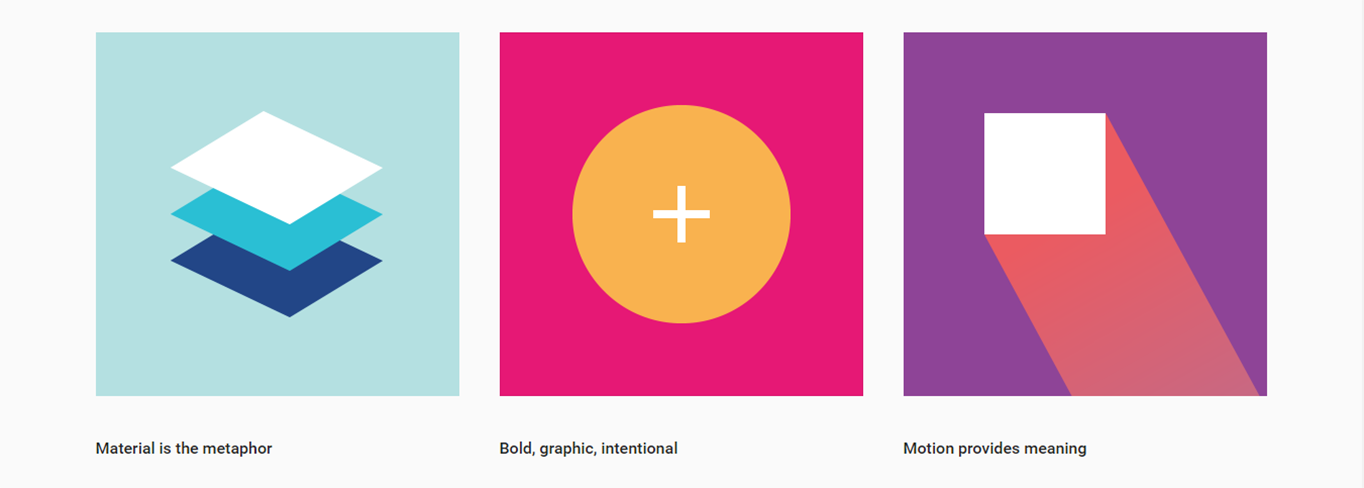
Nope, it’s also about finding the right color. If you haven’t experimented with this Material Design Palette yet, take a moment to do so now. You’ll see that regardless of which branding colors you select, the primary and secondary font color are always black or a shade of grey.

material-design-color-palette-new

6. How about accessibility?

Web developers know all about how to make websites accessible. However, if you’re really looking to give your typography a universal-friendliness in this next iteration, pay closer attention to factors that may affect those who are visually impaired or color blind.

Start by running your website through Color Oracle. This tool will simulate how your website appears to those who are color blind.

You never know who may come to your website, so it’s important to consider these factors now while you’re taking the time to give your typography a facelift.

Step 2: Learn Typography Best Practice

Font choice is a personal decision, much like everything else in web design. So while I cannot tell you which fonts to use, I still think it’s important to lay out the best practices to follow while doing your research, testing, and implementation of new ones.

Here are the basic rules to follow:

  • Match your brand: Select a font that follows the design rules you’ve already established for your brand.
  • Keep it simple: Use no more than two or three typefaces across your website. That being said, it’s okay to use a font face that’s a little out of the ordinary, just make sure it’s easy to read.
  • Maintain consistency: Use consistent font styling throughout the site. In other words, all headings should use the same font, size, color, and style. The same goes for all body text, navigational text, hyperlinked text, and any other types of text you use on the site.
  • Create contrast: While consistency across font type matters, there should be a contract between headings and basic body text. You can do this by pairing a sans serif font with a serif or a cursive font with a handwritten one. Just be sure the contrast is striking, though not to the point of being off-putting.
  • Check the color: As noted earlier, black or shades of dark gray work best for readability. There’s also the background color to take into consideration as well, so it’s important to pair colors accordingly (i.e. light text on a dark background and dark text on a light background).
  • USE ALL CAPS SPARINGLY: All caps text can be very difficult to read. Either that or it may give off the wrong vibe. So, if you feel you have to use it, do so sparingly.
  • Establish hierarchy: Just because the general rule is to use a font size of at least 16 points, that doesn’t mean all your site’s typefaces need to stick to that minimum limit. Headers, subheaders, and body text should be sized to establish a clear hierarchy in terms of what’s most important.
  • Don’t forget about spacing: Once you’ve implemented the new typography on your site, you’ll want to optimize its spacing. If there are issues with lines spaced too closely with one another, fix the leading. If there are issues with readability within a line of text, you’ll need to adjust the kerning and maybe even the tracking. Ideally, each line of text should stretch no more than 15 words.
  • A/B test before making a commitment: While you might be ecstatic about your new font choice, other people might not feel the same way. Do yourself a favor and make sure to A/B test your new font choice before fully committing to it. Your website (and business) will thank you for it later.

I hope these few fonts facelift tips and tricks will help you out in revamping your site to increase more visitors.
Leave your precious comments below if you are facing any challenges or if you want to add value to this blog post by sharing your experiences.

And yes don’t forget to read How To Use Social SEO To Increase Website Ranking and,

How To Increase Your Facebook Page Post Reach.

If you are web design pro, Top 10 Web Design Trends is for you.

Top Web Templates To Start Your 2017

The single thought of you using a ready-made template for your website makes a lot of web designers envy the design so much. Top web templates are wrecking the industry with their readymadeness and awfulness.

The ultimate thing is, while there are lot of website templates out there with cons and pros, there are plenty of templates that falls in the category of good examples developed with lot of care and inspiration.

Lets see such kind of good examples that are ruling the web design templates out in the market. Who knows maybe you’ll find what you are searching for so long.

Top Web Templates To Start Your 2017 With

1. MAPLE (WordPress)

maple-wordpress-theme

There are six reasons you’ll love Maple, say its developers: its bold and unique design, it’s responsive and retina-ready, it features light and dark styles, parallax header backgrounds and multi sidebar support, and it’s super-easy to use. With 15 layout combinations plus plenty of features and widgets, at $49 it gives you your money’s worth.

2. BETHEME (HTML5)

bethemes-html5-template

Why settle for one theme when you can have over 210? Described as the most complete, comprehensive and flexible HTML template for business or personal websites, BeTheme is simply crammed with stuff. Fully responsive and retina-ready, with all the parallax and smooth scrolling features you’d expect, it’s an absolute monster and the biggest headache it’ll cause you is trying to choose from the enormous selection of pre-built sites. For $19 you can’t go wrong.

3. JUPITER (WordPress)

jupiter-wordpress-theme

Jupiter confidently describes itself as the world’s fastest and lightest WordPress theme ever, and its latest version been completely reviewed and rewritten to deliver lightning-fast pages that won’t thrash your CPU or drain your batter.

It uses GPU rendering to deliver smooth parallax scrolling, it features adaptive image resolution to ensure that pictures look great regardless of devices, and it comes with over 85 templates in case you don’t have time to build your own pages with its drag and drop interface. It’s not cheap at $59, but the results are worth it.

4. ENIGMA (WordPress)

enigma-wordpress-theme

Enigma Premium theme is a super professional one page WordPress theme for modern businesses. Ideal for creative agencies, startups, small businesses, and freelancers and best of all it’s so easy to use that you can have your website up in minutes. Perfect to promote your work or your creative business. It is cross-browser compatible, fully responsive, and retina ready.

It is one of our most customizable and flexible themes, you can create practically unlimited versions of your website, your imagination is the only limit. It includes an awesome slider, filterable portfolio, beautiful galleries, different background patterns, rich color changer, light/dark color skins, boxed/wide layout styles, additional page options and much more. Compatible with WPML & Woo Commerce Plugin. With $39 to invest, this amazing theme will be yours.

5. SUMMER (Ghost)

summer-ghost-template

PXThemes specialises in Ghost template and themes, and Summer is one of its most popular offerings. For $19 you get a simple and clean template with plenty of options to help your content stand out, including author pages and full screen covers, parallax blog background covers, and Foundation 5 and Disqus integration.

6. CREATIVE (WordPress)

creative-wordpress-theme

Creative Premium is perfectly scalable, performance and responsive, multi-purpose WordPress theme and suitable for Business. Perfect to promote your work or your creative business. It is cross-browser compatible, fully responsive, and retina ready. $39 is what this theme will cost you but be assured as plenty of theme options makes it product for your money.

7. YUGA (Muse)

yuga-website-template

If you’re using Muse and you want plenty of options as well as value for money, look no further than Yuga. Billed as a 6-in-1 creative multipurpose true parallax template, it comes with six themes with plenty of transitions and animation that are easy to implement. It has loads of online documentation, including step-by-step editing tutorials, and it’s yours for just $25.

8. AVADA (WordPress)

avada

Avada ($60) claims to be the best-selling WordPress theme of all, and it certainly has a lot going for it. It might be a third-party template, but the underlying framework is flexible enough to enable the crafting of all kinds of design styles, and there are tons of user-friendly tools and options for subsequently fine-tuning the resulting site.

9. RED CAP (HTML5)

redcap-html5-templateThis one’s a single-page HTML5 template, based on Bootstrap, boasting plenty of customisation options and a MailChimp subscription form. It’s primarily aimed at people wanting to create ‘coming soon’ landing pages for upcoming projects or products, and for $7 saves you the hassle of smashing together countdown scripts and the like yourself.

10. HUGE (Tumblr)

huge-tumblr-template

This $19 effort by Precrafted is aimed at people wanting a blog that is heavy in imagery and videos. Many elements can be fully customized, and keyboard navigation makes it easy to quickly jump between posts when using traditional keyboard input. The design also includes a fixed (but not distracting) menu and options for controlling how photos appear.

I hope you have liked top web templates for 2017.

In case if you’ve missed How To Use Social SEO To Increase Website Ranking or our newly launched app Appointment Scheduler Pro, check them out.

Few Ways To Make Your Site Easily Accessible

Structuring a page and it’s assets makes it properly machine-friendly, whatever that machine is. Add the kind of common sense techniques that allow users (including users with disabilities) and machines to get straight to meaningful content, and for sure you are moving towards make your site easily accessible and search engine friendly.

We all are familiar with the power of WordPress which allows a newbie or non technical person to design and develop their own web property. This platform is simple to set up, and provides a solid framework for the themes and plugins that will determine how your content and functionality will go on for any visitor.

If you want your site to be accessible to individuals with disabilities, you’ll find that basic WordPress has much that is needed to facilitate the development of an accessible website, and it is not hard to take that further through the addition of plugins and good technique.

Before we get started, there are two important factors to be aware of. First, implementing these four techniques alone will not make any website totally accessible for everybody to the extent of complying with all the necessary  requirements but it will address the most common barriers to web access and deliver much greater accessibility.

Second, it’s important to understand that accessibility can only be achieved through the co-operation of design, development and best content authoring practices. A designer may design an accessible theme, a developer might add accessible functionality, but if a content author inserts a meaningful image without an alt tag, the full meaning of the web page will be inaccessible.

With that in mind, here are four tips for you to make your site easily accessible.

Alt Text For Your Images

It is well known that the single greatest barrier to web accessibility is using alt text properly to describe images on a web page. If this single point was addressed by everyone who builds websites, it would eradicate the largest number of accessibility complaints. And that’s the reason why we felt the urge to develop an amazing plugin SEO Image Optimizer, which fills the gap of missing alt tags on the images.

The fundamental point to understand is that if you are going to put images on your site, it is essential that you label them correctly with alt text. In other words, every image you are putting online must have a meaning for the robot to list your image on the search engines.

The information in the alt tag allows users of screen readers (which read web pages aloud to users with visual disabilities), text only browsers and slow connections that won’t load images to understand the information conveyed by images.

If an image does not have meaning, for example it is used purely for decoration, there are two ways to deal with it. If you load it as a background image using CSS, screen readers will ignore it and the image does not require an alt tag (be careful, becuase this also applies to meaningful images: if you load it in background, the screen reader will ignore it). If an image is displayed using HTML but is purely decorative, then use the alt tag but leave it empty. That tells the screen reader that an image is present but has no meaning for the user and can be ignored which allows to make your site more accessible for a reader

When you put label on your images, use some descriptive text that will allow people who cannot see to understand what the meaning of the image is. This requires judgement: why the image has been here and what message does it convey, and what words will best convey that same meaning. Don’t get caught up in literal descriptions of every visual detail, convey the meaning.

A classic example is an image of a magnifying glass used as a button to start a search. The image has a meaning, so it should be described. Describing it as “a magnifying glass” does not help the user. What they need to know is that clicking on this button will start a search, so alt text of “click here to search” or even just “search” may be most appropriate.

Only images that serve a purpose must be labeled. Examples of these are as follows:

Images that are used as buttons

Images that are used as links

Images that are used for any other controls

Images that directly relate to the content

This technique applies to all websites, of course, not just WordPress sites. WordPress, however, makes it easier than most, firstly by allowing the content author to switch between Visual and HTML views, and secondly by providing a field for alt text whenever an image is inserted using Add Media functionality.

Plugins For Better Accessibility

WordPress accessibility can be enhanced by using a variety of plugins. These plugins are easy to set up, and they will enable users with a wide range of disabilities to access the site. Here are some plugins I’ve found which will make your site easily accessible.

Access Keys

The Access Keys plugin allows access keys to be assigned to links and controls on your website. For instance, the home link may be assigned the access key combination alt+h and the search button may be assigned the alt+s key combination. Access keys, such as the examples provided, enable visually impaired users as well as those with mobility issues, to easily access what they want.

Easy Retweet

Easy Retweet is a plugin that will allow you to add accessible buttons to your page that facilitate sharing your content on Twitter. This way, if individuals with disabilities wish to share your pages with their friends, they can do so without any difficulty.

AStickyPostOrderER

AstickyPostOrderER lets you choose the order in which your content is displayed. You can choose to display content from oldest to newest or in the reverse order.

Hackadelic SEO Table of Contents

The Hackadelic SEO Table of Contents plugin enables you to provide a table of contents for either your posts or your pages. This will make your content easy to find.

WP-Polls

WP-Polls permits individuals with disabilities to participate in any polls you may have on your site

New plugins are being developed all the time. Use the WordPress dashboard functionality to search for more. Try different plugins and ask your users with disabilities to give you feedback

When using any plugins, make sure the plugins use are compatible with your chosen theme, as well as with one another. If your plugins are not compatible with your theme, they will either not work or will cause more problems for disabled users who try to browse your site. If your plugins are not compatible with one another, your site can be rendered unusable or content may be displayed incorrectly.

Way To Go With Headings

When you design pages, it is vital to structure the content using headings in the correct order: <h1>, <h2>, <h3> and so on. When you structure the content using headings, people using screen readers can get a summary of what the pages are about and navigate them more easily. Screen reader users can access the sections of content that they want by pressing the letter “H” to go forward and “shift+H” to go backwards.

You can label your content using headings one through six to make your site easily accessible. Check how your theme uses headings (for example, your theme may or may not apply <h1> to the site title and that site title may or may not appear on every webpage. Either way, make sure the first heading used is <h1> and the following headings (page title, page sub-sections, paragraph headings) descend in order through to <h6>, where appropriate.

There is some flexibility about the ordering, but the most sensible option is to keep headings in numerical order and really don’t mix them up as it will create an hazardous situation both for user and a search engine (Do no mix them like this –> <h1>, <h4>, <h2>, etc).

Navigation Links Are Useful

Finally, you need to have navigation links in your site design. These navigation links will allow users with disabilities to skip past the navigation bar or other menus and search boxes and jump to certain places on the page by clicking these links. Or, the user can quickly jump to desired sections on the site. These links need to appear wherever it is necessary for users to skip to meaningful content. Examples of what these links may say are:

Skip to Main Content

Jump to Navigation Bar

Jump to Search

Some WordPress themes may already provide such links. If this is the case, you will need to check to these links to see if you have to add any of your own. Other themes, however, will not provide navigation links. Thus, you will need to add these links yourself.

Wrapping Up

I’ll repeat what I’ve said earlier that none of these steps guarantee you 100% accessible website but yes it will boost your site’s accessibility for every visitor visiting your site and  your site is more accessible then 90% of the WordPress websites out there.

Visitors with disabilities will be able to navigate through your site just like other visitors. Since these visitors also include search robots, you should be assured of one thing that making your site accessible will also benefit your business and help you rank on top on the search engines ultimately resulting in more profit out of your business.

I hope this blog post was useful for you and you are taking some key elements from here that you’ll


How To Use Social SEO To Increase Website Ranking

Most of the people are familiar with the term SEO or search engine optimization and are using social media in their daily life for posting pictures, updating status or liking or commenting on some posts. But it’s unlikely they have heard about Social SEO. What if both are combined together to create a magical effect which will increase your website’s rank on SERP organically.

Yes, this magical wand exists and the name is Social SEO.

What is Social SEO?

Social SEO is a logical term which elaborates as the use of social media to enhance SEO of your website. In short, the crossover of social media and SEO is known as Social SEO. Not many people are used to how SEO for any site works but everyone majorly knows how social media platform works and how it has the power to make you famous overnight, and that goes with SEO too as everything you share, comment or like on social media is being over watched by the search engines and they are considering these social signals as one important ranking factor for your site.

You can get good rankings by paying no attention at all to social SEO, but you can’t rank your business’s website through social SEO alone. So then why bother with social SEO, if it’s not essential? Because positive social activity around your website makes it easier/faster to rank your site in search engines – directly through the authority that search engines give to Likes, Tweets, and Google +1s, and indirectly through exposing your content to a wider audience, some of whom will link to it from their own sites.

Social SEO isn’t a separate branch of SEO and it won’t soon be replacing traditional SEO, but social signals are becoming increasingly integrated into search engine’s algorithms. Social signals aren’t as important as backlinks, and they won’t be for a long time, if at all, but backlinks aside, social signals are about as important as anything else. Over the course of the last year or two the question is no longer “do social signals have an effect on website rankings?” but rather “how much of an effect are they having?”.

No one has an accurate answer to that question as no search engine has made public that information. But it does a carry weight to rank your website higher and there is no second thought to that. The importance of social SEO has been steadily increasing and is highly likely to continue increasing in importance too.

Things To Consider For Social SEO

Create content that is highly shareable with others,
Make sure it is easy for people to spread your content,
Set-up a company page/account on Facebook, Twitter, and Google+,
Communicate with people through your social media accounts,
Share every piece of knowledge you can, whether it is yours or someone else’s.

If these things are done correctly, you’ll certainly see hike in the following,

Facebook likes and shares your website gets,
People following your Twitter account,
Tweets by authority users that mention your website,
Google +1s your website receives,
Google+ circles you’re in,
Positive reviews left on your Google+ page.

and without any doubt, these positive social signals will increase your search engine rankings for the keywords that your business is targeting.

Keep an eye over your competitor as if your competitor is doing more than building backlinks, then certainly you should start making your social signals stronger as it will give you an added advantage over your competitor. Since now only backlinks aren’t going to give you the world. To rank much higher, you have to keep Social SEO as part of your SEO strategy apart from your traditional SEO.If your competitors aren’t involved socially online then whilst it lessens the need for you to get involved, it presents a good opportunity for you gain an advantage over them.

Hope you had enjoyed this blog post on Social SEO. Keep Reading and Sharing!

Also, have you read about How To Write Articles on LinkedIn Pulse or Promote Your Business On Twitter?

And don’t forget to check our newly launched plugin to take your appointments efficiently Appointment Scheduler Pro.


How To Write Articles on LinkedIn Pulse

LinkedIn Pulse launched as a publishing platform in 2012 by inviting 150 of the most influential thought leaders to write original content. Today, all members can use Pulse to share their unique knowledge and professional insights with the 433+ million members who interact there.

At the same time that it’s exciting, it’s also a bit intimidating, especially for people who doesn’t fall in the category of writers. While you might see the potential to strengthen your brand and build out your profile, you also want to take the right way to do it. The last thing you want is for people to roll their eyes when they see the subject you chose or approach you took.

Well, here’s a step-by-step guide on how to write articles on LinkedIn pulse.

1. Consider The Output Of The Article

First things first, consider why you want to start writing, what’s the big picture behind the scene. It could be possibly because of few reasons including you want to share your professional expertise, expand your network, strengthen your company’s talent brand, interest recruiters who view your profile, or establish yourself as a thought leader?

Once you’ve nailed down the “Why” you can focus on the “Who”. Does your potential audience consist of colleagues or prospective clients? Or are you trying to engage professionals in a specific niche or industry?

To attract followers and be memorable, you’ll want to have a clear message. Pick a coherent thread that runs through the majority of your posts so you’ll become “known” for something (like struggles for new engineers, or tips for freelancing, or best practices for hiring).

2. Stop Thinking Start Writing

In my experience, writing the first draft is by far the hardest part of the process. I have three words of advice: Just start writing. I wish there were a silver bullet. (There isn’t.) Set aside a specific time period—maybe an hour—when you can write without interruption. Schedule it on your calendar and don’t let anything else get in the way.

Here are several questions to help you start brainstorming:

  1. Have a case of writer’s block?
  2. What’s the best career lesson you’ve learned?
  3. What piece of advice would you give to someone hoping to enter your field?
  4. What are the current trends in your industry?
  5. How will your industry look like in the future?
  6. What’s going on in the news? Is there a story or event where you can provide insight?
  7. What experience has most impacted your career?

When you first get started, don’t worry about whether the sentences flow or whether the pieces all fit. No one will ever read your first draft. (It’s OK if it totally sucks—that’s the reason it’s called a rough draft.) What you’re trying to say will get clearer as you go back through a second (and third) time to revise.

Once you think it’s solid, identify someone who’ll give you an honest and constructive evaluation. Ask her what resonated, what didn’t, and what suggestions she’s willing to offer.

Writers are often given clichĂ© advice to write about what they know. While I agree that sharing personal experiences can strengthen a post, I think better advice is to write something that helps people in some way. It doesn’t matter if you’re helping someone become a better marketer, or learn about a new app, or feel less alone because you shared a common experience—the key is asking you asking yourself if this article will make someone else’s day better in any way.

3. First Impression Is The Last Impression

This is an old saying and so true if we consider linkedin pulse. A majority of people who’ll see a glance of your posts will decide whether or not to open it depending on the title and the image of the article.

If you choose something generic and bland, your reader may never get to all of your great insights.

Your headline should be concise, clear, and give people a reason to click. Readers have a short attention span and you need to capture it. Make sure if you are writing for some niche category, the term should be widely searched or at least put an impact on your reader.( “5 Things I Learned from Applying to 30 Jobs in 30 Days” or “Job Application Lessons?” could be some possible titles if you are writing in job hunt niche)

4. Finalize Your Post

With your headline, image, and content complete, you’re ready to finalize your article. Open the LinkedIn homepage and select “Write an article” on your title bar. This will take you to the publishing platform where you can paste in your content.

Double check to make sure the formatting looks right. You can include block quotes, headers, bullet points, videos, and additional images to enhance your article.

If you include links, make sure they direct readers to the appropriate sites. At the bottom of your post, you can include up to three tags to help others find your content. These tags will influence the specific Pulse channels your article will be considered for.

And always do a final check on spelling and grammar. Nothing will sink your otherwise perfect article faster than typos.

5. You Are Good To Go, PUBLISH!

Once you hit publish on your article, here’s what you can expect:

Your original content becomes part of your profile. It is displayed on the Posts section of your profile.

It’s shared with your connections and followers. Your article will be shown in their feed, as a notification, or via email, if they subscribe to daily Pulse emails.

Members not in your network can now follow you from your long-form post to receive updates when you publish next.

Your long-form post is searchable both on and off of LinkedIn.

A small percentage of articles will get featured in Pulse channels. There are dozens of channels based on geography and industry, and a combination of algorithms and editors determine which articles get featured. To reach a larger audience, share your article on other sites and send it directly to colleagues. You spent significant time and effort writing your article, show it off!

Appointment Scheduler Pro

At times it is really difficult to manage a business and it’s much difficult to engage with your users and tougher when it is about managing services for your clients and doesn’t make it tough for them to understand your business and how things work around.

As a service-based business owner, scheduling appointments can be a real nightmare.

Not only can it be a huge and unpredictable time suck, but mis-scheduled appointments can also have a seriously negative impact on both your bottom line and your reputation. If you want to not only remain in business but prosper, scheduling appointments efficiently and reliably should be a top priority.

Fortunately, the solution to efficient and reliable appointments scheduling is a simple one: use a WordPress plugin

That’s the reason why we felt the need of the time and engaged in developing a unique top notch plugin which has super abilities to manage things around for you and that’s the exact point where appointment scheduler pro comes in handy.

How Proper Scheduling Can Boost Your Business

Automating scheduling works can not only save you time but definitely save you from very common human errors, they can boost your bottom line of work too.

Handling bookings and appointments by hand in this day and age is (at best!) inefficient, considering how many timesaving tools that can automate the entire process are available. The (typically small) fee required by such services is more than made up by the reduction in scheduling errors and increase in efficiency improvements which are not the case with appointment scheduler pro.

Better still, according to leading SaaS booking solution provider ScheduleOnce, using an online booking service can lead to a 3x increase in conversion rates for your services.

A good online scheduling solution will also help you reduce lost time and revenue due to clients not showing up, thanks to the ability to send them reminders before their appointments roll around and give them the chance to cancel them if circumstances change.

Appointment Scheduler Pro

Introducing one of its kind ” Appointment Scheduler Pro ” to make things pretty easy for you to manage.

Salient Features of Appointment Scheduler Pro

appointment-scheduler-pro

Ideal For

University and College,

Pet grooming, Sitting and Walking,

Music Classes,

Personal Coaching and Couples Counselling,

DJs and Entertainers,

Car Service Stations,

Doctors and Practitioners,

Almost Everybody!

Test Appointment Scheduler Pro Now!

VIDEO TUTORIAL

How To Increase Your Facebook Page Post Reach

Ques: I have 10,000+ likes on my facebook page, but as soon as I post something on my page, reach comes out to be only 1 or 2 percent of my total fan base. Why does it happen, how to increase your facebook page post reach?

Ans: Facebook’s news feed algorithm does not work to flood the user’s timeline with all the content coming from the pages a user likes. Instead, it depends on how interactive your fan base is with your posts or your content.

So, it is really necessary for us to understand that how facebook news feed works, since if we consider what is happening in the present with all the facebook pages, reaching out to their complete fan base is almost impossible (pages having more than 5k likes).

As Facebook’s Chief Product Officer, Chris Cox, told Time in a 2015 interview:

If you could rate everything that happened on Earth today that was published anywhere by any of your friends, any of your family, any news source
and then pick the 10 that were the most meaningful to know today, that would be a really cool service for us to build. That is really what we aspire to have News Feed become.

According to Facebook, organic reach is defined as how many people you can reach out for free.

When 2012 rolled around, Page managers/owners learned that only a small amount of their Facebook fans — 16% on average– were seeing their Page posts in their News Feeds. And that fraction has only gotten smaller and smaller since.

If you’re going to pay-to-play, get your targeting right. Once you’ve built an audience of relevant fans, focus on advertising the content assets you’ve created — blog posts, ebooks, etc. — and use ads to amplify them to targeted users. Techniques such as browser fingerprinting, though sometimes criticized for privacy reasons, would even allow you to track these targeted users across multiple platforms.  Remember: It’s likely only a matter of time before organic reach hits zero, so you might as well hone your paid strategy now, which brings me to one final recommendation and to our last point of the matter.

A study from Edgerank Checker found that between February 2012 and March 2014, organic reach for an average Facebook Page dropped from 16% to 6.5%. Research from Social@Ogilvy, meanwhile, suggests that for Pages with more than 500,000 Likes, organic reach could be as low as 2%.

If we consider above-stated stats, it will mean that a page with the fan base of 10,000 or more will have an average post reach of around 650 (6.5% of total) or so and if fan base rises up to 1 million, only 20,000 fans will see your post (2% of total).

So, now what’s the solution? Facebook told us to buy the fan base first through page likes ads and then asking us to pay more to interact with them through post reach ads.

As quoted by Facebook’s VP of Advertising Technology, Brian Boland,

No. Our goal is always to provide the best experience for the people that use Facebook. We believe that delivering the best experiences for people also benefits the businesses that use Facebook. If people are more active and engaged with stories that appear in News Feed, they are also more likely to be active and engaged with content from businesses.

Now, when we have understood a little bit about how facebook news feed algorithm is working and how facebook is tackling it, let’s learn how to increase your facebook page post reach.

How To Increase Your Facebook Page Post Reach

1. Be Choosy For What You Post

Marketers have to switch gears from “ untargeted and frequent publishing ” to “ targeted and selective publishing.” The goal is no longer to spray and pray — it’s to get as much interaction from a single post as possible. Each post published to a brand Page can be targeted to a specific audience regardless of whether or not it’s sponsored, which may improve overall interaction with that post among other people who are likely to find it more interesting and relevant.

2. Tell your fans to check Page Feeds on the Left Sidebar Of Their Timeline To See Content From Pages They’ve Liked

page-feed-how-to-increase-your-facebook-page-post-reach

3. Educate Your Superfans That They Can Update Their Notification Settings On Your Page

how-to-increase-your-facebook-page-post-reach

4. Motivate Your Fans To Engage With Your Fans More

This is the toughest part, although giving free goodies or a heavy discount coupon can do the trick here. Many times you must have seen that people opt for polling options to encourage their fans to engage with your page and it’s content.

Sometimes this could be as simple as “ Please Like And Share ” at the end of your posts. But I guess we aren’t that lucky as this trick works for the luckiest of the luckiest lot.

5. Dedicate More Time For Your Owned Assets

Since the only constant with Facebook (and the larger digital media landscape) is change, it’s always safest to focus on the digital channels you entirely own and control — your website and blog. Spend the vast majority of your effort creating content (blog posts and long-form content such as ebooks, case studies, or videos) that will continue to garner inbound traffic, leads, and customers long after they’re first created. If you have time and budget, share those assets to Facebook for additional reach.

6. Facebook Is Now A Paid Ad Platform More Than Social Media Channel – Admit It!

If you’re going to pay-to-play, get your targeting right. Once you’ve built an audience of relevant fans, focus on advertising the content assets you’ve created — blog posts, ebooks, etc. — and use ads to amplify them to targeted users. Remember: It’s likely only a matter of time before organic reach hits zero, so you might as well hone your paid strategy now, which brings me to one final recommendation and to our last point of the matter.

7. Facebook Ads, Go Beyond The Basics

Being a social media platform with more than 1.86 billion users, facebook has sharpened it’s targeting capabilities. Facebook ads are now advanced more than ever with many targeting options for it’s advertisers. Additionally, there are a bunch of tools and features that can help you maximize the effectiveness of your campaigns, including …

Conversion Tracking: Track the actions of site visitors after viewing your Facebook ad.

Custom Audiences: Target Facebook ads based on your email list.

Lookalike Audiences: Target Facebook users similar to your customers.

Audience Insights: Learn about your existing Facebook audience to better target your ads.

Website Custom Audiences: Target Facebook users who have visited your website before.

Facebook Exchange: Place retargeted ads on Facebook for users who’ve visited a certain product or service page on your site.

Lots and Lots of Customizable Reporting: Create reports based on metrics that matter most for your business.

WARNING: Nobody in this world, including me and the genie, can tell you the tactics to achieve 100% post reach to your complete fan base as this way facebook will go out of business and have to rectify other ways of earning. Following steps mentioned in the blog will definitely help you in increasing the post reach but up to an extent.

Hope you had liked this post, Keep reading and Keep sharing!

Read out our first ever meme blog and How To Increase Conversion On Your Website.

50 Funny Web Designer Memes

Enough of WordPress and Marketing related posts, Let’s Laugh Out Loud today.

Presenting 50 Funny Web Designer Memes of all time.

1.
1-50-Funny-Web-Designer-Memes2.
2-50-Web-Designer-Memes

3.
3-50-Funny-Web-Designer-Memes

4.
4-50-Funny-Web-Designer-Memes

5.
5-50-Funny-Web-Designer-Memes

6.
6-50-Funny-Web-Designer-Memes

7.
7-50-Funny-Web-Designer-Memes

8.
8-50-Funny-Web-Designer-Memes

9.
9-50-Funny-Web-Designer-Memes

10.
10-50-Funny-Web-Designer-Memes

11.
11-50-Funny-Web-Designer-Memes

12.
12-50-Funny-Web-Designer-Memes

13.
13-50-Funny-Web-Designer-Memes

14.
14-50-Funny-Web-Designer-Memes

15.
15-50-Funny-Web-Designer-Memes

16.
16-50-Funny-Web-Designer-Memes

17.
17-50-Funny-Web-Designer-Memes

18.
18-50-Funny-Web-Designer-Memes

19.
19-50-Funny-Web-Designer-Memes

20.
20-50-Funny-Web-Designer-Memes

21.
21-50-Funny-Web-Designer-Memes

22.
22-50-Funny-Web-Designer-Memes

23.
23-50-Funny-Web-Designer-Memes

24.
24-50-Funny-Web-Designer-Memes

25.
25-50-Funny-Web-Designer-Memes

26.
26-50-Funny-Web-Designer-Memes

27.
27-50-Funny-Web-Designer-Memes

28.
28-50-Funny-Web-Designer-Memes

29.
29-50-Funny-Web-Designer-Memes

30.
30-50-Funny-Web-Designer-Memes

31.
31-50-Funny-Web-Designer-Memes

32.
32-50-Funny-Web-Designer-Memes

33.
33-50-Funny-Web-Designer-Memes33-50-Funny-Web-Designer-Memes

34.
34-50-Funny-Web-Designer-Memes

35.
35-50-Funny-Web-Designer-Memes

36.
36-50-Funny-Web-Designer-Memes

37.
37-50-Funny-Web-Designer-Memes

38.
38-50-Funny-Web-Designer-Memes

39.
39-50-Funny-Web-Designer-Memes

40.
40-50-Funny-Web-Designer-Memes

41.
41-50-Funny-Web-Designer-Memes

42.
42-50-Funny-Web-Designer-Memes

43.
43-50-Funny-Web-Designer-Memes

44.
44-50-Funny-Web-Designer-Memes

45.
45-50-Funny-Web-Designer-Memes

46.
46-50-Funny-Web-Designer-Memes

47.
47-50-Funny-Web-Designer-Memes

48.
48-50-Funny-Web-Designer-Memes

49.
49-50-Funny-Web-Designer-Memes

50.
50-50-Funny-Web-Designer-Memes

PS : This one goes in Uncategorized category of posts 😛

Top 10 Web Design Trends

Top 10 Web Design Trends

If you’ll ask me one habit that all successful people carry with themselves, it will be to be updated in their business area. Same goes with web world as if you are doing any business online (who is not?) then you have to maintain your virtual store, business website or your blog up to date according to the running trends those are attracting people. The web is evolving at a rapid pace and new technologies and development techniques are appearing every day and that gave me a chance to talk about top 10 web design trends.

In this blog post, we are going to talk about Top 10 Web Design Trends which are going to take over the web world. The below list which we are going to elaborate in a while isn’t all new as it has some trends those were gaining or maintaining their popularity in the previous year. To stay ahead in the race, make sure every tini tiny bit of your website is trendy.

1. Color

When we design our homes, the color scheme of the walls is definitely a topic to get confused with and needs a lot of discussion and variations. It is not possible for us to paint a new color on the wall and then see whether it is looking good or not but thank god when we are creating our very own website, we have the liberty to try and test and play with the color scheme of our website until we are satisfied with the final output.

According to businessfinder,

  • 93% of consumers place color and appearance above other factors when making a buying decision.
  • 85% of shoppers state color as the primary factor in their decision to buy a product.
  • Brand recognition, which links directly to consumer confidence, is increased by 80% when the right colors are used.

Color choice for a website is incredibly important. It can influence visitors’ emotions, thoughts, and conversion rates. So, what are going to be the color trends for 2017?

Pantone has unveiled their 2017 color of the year – Greenery. It’s been chosen as a symbol of new beginnings; a refreshing and revitalizing shade.

pantone-color-of-the-year-2017-greenery

If you have right set of the color combination on your website, it is more likely for your customers to purchase your product.

2. Retro Is Back With Modern Twist

You never know what can appeal more to your customers and since now everybody is using the internet, we have retro designing with a modern twist. Retro lovers always seek for a pinch of retroism in the new web trends and now that is a real trend where people are mixing it with the modern style web designing to balance it out for a vast number of modern and retro lovers.

This interactive resume of Robby Leonardi is a brilliant example of modern retro. He has combined a semi/modern pixel art style with the side scrolling of a Super Marioesque video game.

retro-image-example


 3. Cinemagraphs

Cinemagraphs, as the name suggests, is a mixture of a photograph and a video. It contains a still image with some repeatedly moving elements that can prove to be an eye catcher as far as marketing your product is considered. They certainly made their spot in top 10 web design trends.

Cinemagraphs can either be GIF files or video. Both can result in rather large file sizes if the cinemagraph is of a high quality. Cinemagraph GIFs can easily be over 3MB, so you might want to consider streaming video instead.

You can check Flixel or Cinemagraphs for some quite astonishing cinemagraphy.

top-10-web-trends-cinemagraphy-example

4. Material Design

Google’s Material Design has been on the scene since 2014. It is essentially built of on the principle of paper and ink, translating the qualities of these into a digital format. For example, the use of shadows and edges to indicate what you should touch, such as buttons.

material-design-principles-top-10-web-trends

In the past couple of years, Material Design has grown in popularity, with numerous themes and templates being created for CMSs as well as front-end frameworks such as Twitter Bootstrap. One negative feedback you will hear for Material Design is that many of the sites built using it seem very similar; perhaps too similar. This is due to adhering too rigidly to the style of Material Design, rather than just applying the principles.

I’m anticipating that we will see many smaller web projects adopting Material Design as-is. Not just the Material Design principles, but the actual style or theme. However, we will likely see a portion of the design community actively going against Material Design, or at least going against the stereotypical style, whilst still implementing the principles.

5. Be Bold And Creative With Your Typography

The previous year saw the creative use of typography and 2017 is going to see the advancement by pushing the boundaries of web designing. Expect type to not only take up more space on the screen but also expect to see more creative typefaces than the usual web fonts you are used to.

Bolden did a great job my mixing the colors and implementing bold and much creative font types.

bolde-ful-example-top-10-web-trends

6. Flexible or Modular Design

Implementation of flexible or modular designing in your web layout isn’t a new thing but it has been gaining the popularity among the population. According to some stats, 2011 was the year when people started showing interest in modular designing for their business or product based website and I am anticipating that it will keep on growing this year as well and certainly hold all right to be in the list of top 10 web trends.

Warwick University has also incorporated the modular design approach into their website.

block-website-top-10-web-trends

7. SVGs

Are you tired of logos and other images resizing terribly? If so, you should try out SVG files instead of the usual PNG and JPG formats. The SVG format isn’t suited to all images; they’ll only work with vector graphics, so you can’t go and infinitely scale any photos. However, for images like logos, they work brilliantly.

SVGs have been around since 1999, but still, we see the PNG and JPG formats being used for images when SVG would be the more appropriate format. This all seems to be changing though. You’ll likely have seen SVGs being mentioned more and Google Trends data shows that interest in SVGs has been growing year on year since 2013. I am anticipating increased usage of this format in 2017 as well as an increase in articles written on the topic.

Why should you use SVGs? The main reason is that your SVG image should render perfectly no matter what the scale. Also, images in the SVG format tend to have very small file sizes; great for your page speed.

If you want to see an SVG in action, then look no further than the WPMUDEV logo in the top left corner of this page. If you zoom in using your browser, you will see that the logo doesn’t become pixelated, no matter how much you enlarge it. Instead, the WPMUDEV logo remains sharp and of a high quality.

8. Flexbox

Flexbox is a CSS3 layout mode that makes it much more efficient and predictable when working with page layouts that will be displayed using various screen sizes and devices.

Flexbox has been steadily gaining interest, and with it now being supported by all modern browsers, it’s likely more front-end developers will be using it.

9. 360 Videos And Virtual Reality

I am one hundred percent sure that 2017 is going to be the year of VR. Many WordPress theme and plugin makers have already said that it is the future for web designing and they are working on projects like these.

If you aren’t already aware, Google VR View is a JavaScript API that easily allows you to add 360 video experiences to your own website. You can read more about Google’s VR View here.

An interactive, 360 web VR experience was created for the new Blair Witch movie. This is best viewed on mobile using a VR headset for your mobile or if you love traveling, Airpano is suitable for you to test.

blair-witch-top-10-web-trends

10. Microinteractions

Microinteractions are single, specific moments when a user is interacting with your website. It doesn’t have to be a website per se, but in our case, it is. These moments could be actions such as liking a post, sending a message or filling in a form field. The purpose of microinteractions during these moments is to provide feedback and guidance for the user, improving UX.

Microinteractions have become increasingly popular, and the ways in which feedback and guidance is provided to users is getting ever more creative. Expect to see much more of this in 2017.


Ending Up

Well, that’s pretty much it. Hopefully, this blog post has introduced you to some new web trends and technologies that you weren’t aware of about.

Be creative while designing your websites but keep it in mind that you are making changes those look appealing to your users, you don’t have to add up unnecessary changes just for the sake it’s trending.

If you haven’t read about Ecommerce Trends For WordPress, Read out loud.

Or WordPress Trends for 2017 or Content Marketing Trends for 2017.