Customize Through Inspect Element – For DIY Users

Did you ever gave a thought to temporarily customize any webpage to check how it will look like with specific set of colors, fonts, and styling that you always wanted to see on your webpage. It’s possible with a tool that already exists in your browser called Inspect Element and you can customize through inspect element easily. This is a dream come true for all DIY(Do-It-Yourself) users when they find out about it. In this article, we will show you the basics of inspect element and how to use it with your WordPress site.

Inspect Element, Heard it for the first time?

Modern web browsers like Google Chrome and Mozilla Firefox has built-in tools which allow web developers to debug errors. These tools show the HTML, CSS, and JavaScript code for a page and how the browser executes the code.

Using Inspect Element tool, you can edit HTML, CSS, or JavaSCript code for any webpage and see your changes live (only on your computer).

For a DIY website owner, these tools can help you preview how a site design would look without actually making the changes for everyone.

For writers, these tools are awesome because you can easily change personal identifying information when taking your screenshots eliminating the need to blur out items altogether.

For support agents, it’s a great way to identify the error that could be causing your galleries to not load or your sliders to not work properly.

We’re just scratching the surface of use-cases. Inspect element is really powerful.

In this article, we will be focusing on Inspect Element in Google Chrome because that’s our browser of choice. Firefox has its own developer tools which can also be invoked by selecting inspect element from browser menu.

Ready? Let’s get started.

How To Launch Inspect Element?

You can launch inspect element tool by pressing CTRL + Shift + I keys on your keyboard. Alternately you can click anywhere on a web page and select inspect element from browser menu.

how to customize through inspect element inspect element menu

Your browser window will split into two, and the lower window will show the web page’s source code.

The developer tool window is further divided into two windows. On your left, you will see the HTML code for the page. On the right-hand pane, you will see the CSS rules.

how to customize through inspect element inspect html css panes

As you move your mouse over the HTML source you will see the affected area highlighted on the web page. You will also notice CSS rules change to show the CSS for the element you are viewing.

how to customize through inspect element inspect element editing any particular item

You can also take the mouse pointer to an element on the web page, right click and select inspect element. The element you pointed at will be highlighted in the source code.

How To Edit Code In Inspect Element Window?

Both the HTML and CSS in the inspect element window are editable. You can double click anywhere in the HTML source code and edit the code as you like.

how to customize through inspect element inspect editing html

You can also double click and edit any attributes and styles in the CSS pane. To add a custom style rule click on the + icon at the top of CSS pane.

how to customize through inspect element inspect edit css

As you make changes to the CSS or HTML those changes will be reflected in the browser instantly.

how to customize through inspect element inspect element changes preview

Note, that any changes you make here are not saved anywhere. Inspect element is a debugging tool, and it does not write your changes back to the files on your server. This means that if you refresh the page, all your changes will be gone.

To actually make the changes, you will have to edit your WordPress theme’s stylesheet or relevant template to add the changes you want to save.

Before you start editing your existing WordPress theme using Inspect Element tool, make sure you that you save all your changes by creating a child theme.

Debug Errors On Your Website

Inspect element has an area called Console which shows all the errors that exist on your website. When trying to debug an error or requesting support from plugin authors, it’s always helpful to look here to see what the errors are.

how to customize through inspect element errors in console tab

We hope this article helped you learn the basics of inspect element and how to use it with your WordPress site.

If you liked this article, then please subscribe to our YouTube Channel for WordPress video tutorials. You can also find us on Twitter and Google+.

Also you can read Top Ways To Make Website More Secured and how to get a Free SSL Certificate For Your Website.

Top Ways To Make Website More Secured

Are you running an online business or managing an online blog, then for sure maintaining your website’s security would be a major concern for you. From viruses and phishing scams to large-scale data espionage, the internet is a minefield of cyber threats that need to be avoided at all costs. And that’s the reason why we need to learn ways to make website more secured.

What’s more, such online attacks are constantly evolving in terms of both form and complexity, so it’s absolutely crucial to remain one step ahead. So, here are five ways to safeguard your website against malicious encounters.

1. Keep Your Software’s/Plugins/Extensions Always Updated

I won’t deny the fact that those little pop-ups that appear every now and then reminding everybody to run a software update are really annoying at times. And yes, it can be extremely tempting to postpone them – or worse, ignore them altogether. However, in doing so, you are making your website an easy target for cyber criminals.

If you are running your site via a managed hosting solution, the hosting company itself should see to it that all necessary security updates are applied to the operating system.

However, when it comes to third-party software, maintaining tight security is down to you – and it’s essential to be vigilant. Third-party software can be anything from Content Management Systems (CMS) to the software you use to run a forum on your site, and the way you are notified of necessary updates will vary from type to type. Whichever systems you are using, get into the habit of checking regularly for updates and, most importantly, install them as soon as they become available.

2. Install SSL To Your Site

A major issue concerning both website owners and visitors alike is the protection of sensitive data. SSL (or Secure Socket Layer) ensures that data transmitted via a website is encrypted, making it much more difficult for cyber criminals to intercept.

Websites protected by an SSL certificate will have “HTTPS” as part of their web address, whereas unsecured versions simply appear as “HTTP.” Ideally, new websites are developed with SSL encryption, but it is also possible – and advisable – to convert older sites to the HTTPS version.

This can be done by obtaining an SSL certificate, installing it on the server and effectively redirecting your website content to the new secure version. A complete step-by-step guide to converting your site to HTTPS is available for you. You can also get a free SSL certificate through this.

3. Install a Web Application Firewall

A Web Application Firewall (or WAF) acts as a virtual security guard, monitoring the traffic to and from your website and identifying any unusual or potentially dangerous behavior.

A WAF can be cloud-based or appliance-based, and functions as a filter in front of your site, analyzing requests in accordance with a rule base – that is, a set of rules determining what is and isn’t permitted.

One major advantage of a WAF is that it acts in real-time, giving you a better chance of detecting a potential threat before any real damage occurs.

4. Easy Passwords = Easily Crackable

Whilst it may seem like a no-brainer, tough passwords form a crucial part of your armor against cyber attackers. In addition to setting complex passwords for the administrative areas of your site, it is important to ensure that visitors to your site are just as vigilant.

You can encourage users to set more secure passwords by imposing certain requirements, such as a minimum number of upper and lowercase characters, as well as numbers and symbols. Combination of all these creates a really good and unique password which is comparatively hard to breakthrough.

As the website owner, you are also responsible for storing passwords in encrypted form, making it harder for hackers to get hold of them. You can also add another layer of security by using a technique known as salted password hashing.

5. Take A Test Of Your Site’s Security Yourself

Finally, an effective way to ensure your site is well-protected is to test it. Penetration testing – or pen testing for short – can be carried out using free online tools such as ScanMyServer and SucuriSiteCheck.

These tools will attack your site in much the same way that a hacker would, subsequently alerting you to the most vulnerable areas.

Testing your site and reviewing your security strategy on a regular basis will help you to remain one step ahead, decreasing your chances of falling victim to a malicious attack.

The steps written above ain’t new to many people, but the way you can implement them can make your site more secured and less vulnerable to all the habitual hackers.

Also, learn how can you handle your website’s SEO all by yourself and some Factors For Mobile SEO Ranking 2017.


How To Create A Successful Landing Page For Your Website

When building a PPC campaign, finding the right set of keywords and targeting right set of people is very demanding. All this is done to make the user click on your ad and ultimately redirecting the user to your website’s landing page. Therefore, it is very important to know how to create a successful landing page.

When it comes to building a landing page, design is everything. As a webmaster you have very little time to impress your user by your landing page’s design and key components . So, it should be clear to potential leads what you are selling from the moment they get to the page.

Most people believe that aesthetics is the easy part of creating a landing page. But in reality, a poorly designed page has been known to kill conversion rates. Your design will make it easy for people to understand your landing page and convert.

These steps will guide you through designing a successful landing page that converts.

#1 Use Better Images, Context And Videos To Explain

The use of good quality images and videos can show the benefits of your offering. Images and video should have a direct purpose on your page rather than just filling space. It lets potential leads put themselves in the actual situation of your product or services. For example: if a hotel resort puts images of white sands and people relaxing by the beach, it will let people imagine themselves in this situation instead of just reading about it.

Also, display pictures of happy people to make the page welcoming to visitors. It will make your landing page warm and personal. Designers we can use emotions to make potential leads feel a certain way. Displaying a smiling face puts them in a comfortable and positive mood which has a positive impact on the conversion.

#2 Use Colors To Highlight Important Areas Of Landing Page

An example of a contrasting color is having a bright orange button on a dark blue background. People will be naturally attracted to this difference. Use this in your design to highlight the sections of your page that you want to be seen.

The heading, the caption, the form and the CTA should be the most prominent on your landing page. With contrasting colors and good use of white space it’s easier to potential leads to digest the information and convert. One thing to avoid is packing too much information on one page. This is a mistake that many marketers do.

#3 Obvious Call-To-Action Button

Your CTA button is ultimately the most important feature of your landing page. The entire goal of the landing page is to get people to see that button so they take action on your page. The effectiveness of your CTA button can be instantly changed with eye catching design or a great placement.

A couple of design tips: bold the font and make the button quite large.

Generally, place your CTA button on the top part of your page for it to be seen directly without scrolling down. The more specific and clear your button is, the higher conversion rates will be.

#4 Make Your Benefits Clear

Visitors will ask themselves “what exactly am I going to get from this relationship?” Potential leads need to know that your product offering meet their needs. Present your benefits in a clear and simple way that makes them curious for more information. It’s best to present these benefits briefly. This will let potential leads to easily skim through and see if it’s the right product for them or not.

#5 Provide Potential Leads Easiness Of A Single Click

Your goal is to provide potential leads with an easy path to conversion. So you need to provide users with only one action that they can take. This means removing any navigation bars, footers, or outside links that drive attention away from your CTA. Having multiple things on your page for leads to click on, is a huge distraction from your CTA and your main goal. So get rid of the other distractions and keep them focused.

#6 Use Bold Headings To Make It Easy For Potential Leads To Scan

Headings and sub-headings are crucial for a landing page as they hook in potential leads. To explain additional benefits or selling points, use bold headings to attract their attention. Break information down into small digestible segments. With small sections and large headings it would be easier for people to skim the information and really digest what you are saying. Near the bottom of your page you should have a bold statement that should reaffirm your value proposition. This is your last chance to tell potential leads that your offer is the right choice.

#7 Bounce Rates Should Be Lowered

As a visitor there is nothing more frustrating than a huge complicated form. Think simple when thinking of designing your form. You want to make it easy for people to enter on your entry form. A recent study done by Hubspot shows that if you reduce the form fields from 4 to 3 it increases conversion rates. Also, avoid too many dropdown menus. When creating a sign-up form, keep your main objectives in mind. Only ask potential leads for information that is necessary to achieve those objectives.

#8 Loading Speed And Device Compatibility Should Be OK

The loading speed of the landing page is the most important factor to be taken into consideration. 40% of users abandon the page if it doesn’t load within 3 seconds. Even though your landing page is very effective at turning prospects into customers, it’s unlikely to generate a positive return if only half of your audience can see it. Spend more time on improving the loading speed of your page before you launch.

Another important component is compatibility. Make sure your landing page is responsive and opens on all kind of devices and browsers.


Designing a landing page is more challenging that it seems. For it to be profitable and effective, the design of your page is as important as the actual content. Potential leads need to easily read that information and understand the message that you’re trying to convey.

Improve your landing page by following the above steps and you’ll be totally satisfied with your conversion rates.

Also, if you are struggling with views on your youtube videos, read Top 10 Ways To Get More Views On YouTube Videos and Did you know Your Web Design Is Influencing Your Websites SEO? Yes, it is true.

And How To Increase Conversion On Your Website after you have a successful landing page.

8 Components Blocking Your Conversion Funnel

The main reason of one behind building any website is to make the most out of it and by most I meant carving out maximum of the business as possible. And that’s where conversion funnel comes into the picture but there are some components those need to be taken care of before building your conversion funnel.

You must be putting tons of efforts to maximize your website conversions, but are they where they should be?

It is really frustrating when you see that visitors are coming on your website but they are turning away due to badly implemented strategies for conversion funnel. In this post, we will talk about the 8 reasons that could be disrupting the process and turning your visitors away.

1. Ugly Design

bad layout example

The most common reason that turns your would-be customers away is the bad layout of your website. If you want to improve conversions, then you need to make the layout confusion free.

If you are having a cluttered design, then you are deliberately prompting your customers to leave.  Even with a minimalist design you can put your visitors at ease and lower down your bounce rate.

Color schemes play an important role in conversion than you may think. So, you must choose the colors of your layout carefully based on the emotions you want your visitors to feel.

2. Lousy Visuals

Online marketing is completely done through visuals and content, so the quality and type of images you are using on your website matters a lot in making conversions.

According to studies, 92.6% people consider the visual factor while making decisions which means that you should be very selective with the images.

lousy images

If you are using crappy imagery on your website and still thinking of the reasons you aren’t getting conversions, then you are just wasting your time.

3. Page Load Time

Nothing can be as bad as a slow loading website, as no one has the time to waste waiting for your site to load.

According to a Research, almost half of the users abandon your site if it doesn’t load within 3 seconds. So, a lack of speed is eating up your conversions.

page load time

Bigger images also slow down the website, so it is recommended to reduce the image file size to prevent the images from increasing the loading time.

4. Irksome Pop-ups

irksome popups

Most of us abandon the sites when we get hit with these annoying pop-ups. When 80% of the people who visit your site either dislike or hate pop-ups, then what’s the reason that you are using it on your website?

If you want your visitor to convert, then you can ditch this altogether and let someone check out your site as a guest for once. And, later show them the pop-up to collect their email address when they visit again.

5. Bad Copy

If your website is having a bad copy, then it could be one of the reasons your visitors are not making the action you want them to take. If you have a sales copy, then many of your visitors will run away instantly.

The copy of your website should be persuasive and clear to warm up the leads before they get ready to convert.

bad copy website example

6. Confusing Navigation

If your website is so confusing that it cannot take visitors where they want to go, then you are forcing them to leave instead of staying.

too many navigations

Your website visitor should be able to easily navigate your site if you want to increase your conversion rate. It should always be simple and intuitive to decrease the bounce rate.

You should not also include too many navigation items, as this puts a paralyzing effect on them and they get confuse and leave.

7. Multiple CTAs per Page

Each landing page should be solely dedicated for one purpose and should have one goal for the visitors. So, your website should have one compelling call-to-action instead of having too many irrelevant ones.

A website with multiple call-to-actions will have half number of conversions when compared to the one with single CTA button. Because when you reduce the number of options, then it becomes easier to make a decision.

multiple call to action

8. Greedy Forms

A greedy form is the one which has too many fields or ask for more information than required. There’s   always a limit to how much information people would like to provide in a form. So, it is essential to use the right number of fields in your website forms.

According to studies, a form with too many fields reduces the conversion rate. So, to decrease the number of fields you can remove the ‘Retype email address’ field in your signup forms.

too many fields for forms

Wrapping Up

You should check your website every now and then for any loose points or hidden problem, there is no harm in doing that. It also ensures that you are not loosing your potential customer and traffic at the same time.

So start saving your websites conversion funnel by avoiding the above mentioned points while strategizing your conversion funnel.

Also don’t forget to read interesting story of Doctor Roy and SEO-Friendly Content To Boost Your Websites Online Presence.

Alongside with conversion funnel, Gamifying Your Website For Better User Interaction can also be a choice for many.

Gamify Your Website For Better User Interaction

User interaction and retention is one tough job webmasters, site owners, bloggers and marketers has to face. To make all things work properly, you have to think out of the box and to adopt or invent new ways of gathering traffic to your website and then make them stick to your website for any reason. In order to make all these things happen, gamifying your website is also a good option. While not new in the market, gamifying any website is still one the best tricks to capture and hold your website traffic. So, are you in to gamify your website?

According to a report released by the Entertainment Software Association in 2015, 42% of people living in the U.S. play video games at least three hours every week. Michael D. Gallagher, the president and CEO of ESA, added that:

Video games are ingrained in our culture. Driven by some of the most innovative minds in the tech sector, our industry’s unprecedented leaps in software and hardware engages and inspires our diverse global audience.

OK, so it’s important to take note of that statistic since it means that nearly half of all people are already well-acquainted with gameplay. If you drill down even further into the ESA’s research, you’ll find more information on who exactly these game players are. For example, the average gamer’s age is 35 and there’s a fairly even split between the sexes (56% male, 44% female).

How To Gamify Your Website?

Gamification can be fun, educational, drive loyalty, boost brand recognition, and do a whole lot more for a WordPress website. It’s just important not to overdo it. Gamification needs to be memorable for the value it adds, and not just because you created a diversion someone can use for a couple minutes before getting back to work.

With that said, let’s talk about some practical ways you can add gamification features to your own website.

1. Communities

One of the benefits in playing videos games is the opportunity to meet like-minded individuals as they explore the same landscape and universe as you. Some games even allow you to join forces and form your own virtual team, despite never having met one another in real life. If your website has a large community that would benefit from collaboration and communication, forming a membership service and community would be a great way to encourage that same team-like atmosphere.

If you’re interested in creating a community, check out BuddyPress, a free social networking plugin for WordPress.

2. Page Loading Progress Bars

With the right animation, you can keep visitors engaged as they wait for a page to load. Those same type of transitional animations work really well for gamification. Obviously, no one wants to sit and wait for a game (or website) to buffer, but with a short and entertaining enough animation, you may increase the likelihood that visitors stick around longer.


3. Points-Based Features

Further building on that idea of creating a community, if you want to take it an extra step and reward members with points, you can use a plugin like myCRED to do so. For the most part, this plugin focuses on helping users devise points systems and manage visitors’ points accumulation on their WordPress website. Purchase rewards, badges, games, and other related features are available through this tool as well.

4. Tooltips

Most video games will usually give you a quick overview of how to use the controller in order to navigate your way through the game. Think of tooltips in the same way. While your goal should always be to create an intuitive pathway from entry to conversion, sometimes it’s helpful to add quick tips to keep your visitors moving along.

5. Membership Rewards

Now, if what you’re looking for is a wholly comprehensive membership rewards gamification tool, then Captain Up is what you’ll want. This tool comes chock-full of gamification features like badges, levels, trophies, points, currencies, and rewards. You can also use this to manage communication with your community and to promote and reward visitors for engaging with your brand on social media.

6. Quizzes

Want to follow in the footsteps of websites like BuzzFeed and provide visitors with additional entertainment or educational value? Create quizzes, polls, and surveys to keep them engaged and give you an opportunity to gain additional insights about what more they’d like to see from you. Check out Opinion Stage’s 4-in-1 plugin solution for this.

Top 10 Most Illustrated Web Designs

There are millions of websites live on the internet, and you must be one proud web site owner. But due to the very similar look web sites having these days, the original look of any website is lost somewhere and there are very few things you can actually do to make them unique or let’s say make them stand out of the league. Adding illustrated web designs is definitely one on the list of those few things which can actually help you in giving your site that out of the league look.

Today, I’d like to share with you ten unique, fantastic websites that incorporate illustrated images into the design to make them most illustrated web designs. Some do this with simple PNG and JPEG files, while others use Flash in order to make the page interactive. I hope you enjoy the list.

Most Illustrated Web Designs

#1 Hugs For Monsters

hugsformonsters-illustrated-web-design

Hugs For Monsters is the homepage of designer and illustrator Joe Lifrier. The top of each page has a unique colorful drawing that showcases his unique style of illustrations.

#2 The Great Bearded Reef

thegreatbeardedreef-illustrated-web-design

The Great Bearded Reef is a sharp design that was created for the self-proclaimed “bearded one” Josh Willis in order to apply for the position of “Island Caretaker” in Australia.

#3 Pieoneers

pieoneers-illustrated-web-design

At the bottom of the Pieoneers design is an illustrated ice cream character smiling on the moon while sitting aboard a spaceship with a fruit-filled pie on top. I have no idea what the connection is between space and ice cream, but the design highly creative and definitely unique.

#4 Meomi

meomi-illustrated-web-design

Arguably the cutest website on the web, Meomi has an interactive design that will make anyone smile. Whenever you scroll over the outside of the design (that is powered by Flash), something happens. For example, the little animal on the right side of the page will play his banjo, and the nearby piano will play piano music.

#5 Alex Buga

alexbuga-illustrated-web-designs

This is one of the most original personal websites I have ever seen. Every area of the website can be viewed by interacting with the objects on the home page. Alternatively, you can navigate the site by clicking on the AB logo at the top left corner of the design to make a traditional navigation menu appear. From the clock on the wall that tells the actual time to the music player that lets you play around with beats and sounds, Alex Buga’s website is a fun website to visit and a great example of what he can do.

#6 Platin

platin-illustrated-web-design

Platin features a colorful, interactive Flash-based illustration that was used to promote a new apartment block. The transitions from one section to another are beautiful.

#7 K4 Laboratory

k4lab-illustrated-web-design

The K4 Lab website has been featured on many design lists over the last few years (and rightly so). It remains as a great example of how Flash can complement a website design rather than hinder it.

#8 The Many Faces Of

themanyfacesof-illustrated-web-design

A hilarious website that looks at the many faces of Lenonardo Dicaprio, the Goonies, John Cusack, and Alan Rickman. Each section contains a large illustration in the header, as well as illustrated images throughout the content area.

#9 Somos La Pera Limonera

somoslaperalimonera-illustrated-web-design

A fantastic illustration of three designers sitting under a pear tree.

#10 Deborah Cavenaugh

deborahcavenaugh-illustrated-web-design

Deborah Cavenaugh’s homepage looks more like a painting than a web design. The colorful aspects blend into the content area, most notably with the painted search button in the top right corner.


Share your thoughts on these illustrated web designs and whether you liked any of them. Also, check which one suits to your website the best.And don’t forget to see Top Web Templates To Start Your 2017 and Few Ways To Make Your Site Easily Accessible

Most Common Web Design Mistakes – Coffin For A Website

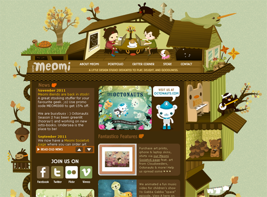
Every day many websites are going live with as many design concepts, we encounter some of the best designs we have ever seen and on the other the hand, sometimes we come across so silly designed websites that prove to be a coffin for that website. Any new visitor coming to that particular website will found himself lost and will abandon the website with that kind of design. So, now the big question is how should we design our website or what are the most common web design mistakes web designers make?

Building a website can be daunting but the real challenge lies in making it usable. The problem is most web designers forget that the website wasn’t created for themselves but to solve the users’ needs. They give creativity priority over practicality and usability.

Let’s see some,

Most Common Web Design Mistakes

Out of many mistakes that we may or may not have seen, we are going to talk out the most blunderous mistake web designers do.

#1 Search The Search Box

The web is like an archive of information. Whether it’s a corporate website or merely a blog, a search box is essential. The visitor might be looking for something that is hidden within the website, with the search box, chances are, visitors will get what they want.

Suggestions: Google Custom Search is a neat, simple and effective way to get started. It enables visitors to search your site in an efficient manner. Just copy the HTML code from the control panel and paste it into your website and that’s it, you’ve got a search function right on your website.

#2 Poor Readability And Unclarity

This is a crucial element of web design. Of course, a good interface design will grab the users’ attention but users have to read the text to be able to grasp the information they desire. Some websites use the most bizarre font styles and sizes that make reading a pain.

Suggestions: Fortunately, there are simple ways that you can do to improve the users’ reading experience on your website.

  1. Compare color schemes of most major sites and notice how the colors improve readability.
  2. Use a Sans serif typeface as it allows for easy reading on the web

#3 Cluttered Content Layout

A website’s content is what drives traffic to it. How the content is structured is what will make it a success or a failure. Users do not read unless absolutely necessary but scan through information and pick out points of interest on a web page. Some designers just put a block of text on the web page and totally neglect headings, sub-headings, bullets, keywords, paragraphs, etc.

Use an appropriate page title for each web page so users know exactly where they are. Some designers even forget to name the web page.

Overall, the worst in this category will be putting inaccurate, inaccessible, insignificant or out-of-date content on your website. The content must coincide with the overall theme of the website and be useful. If a page is under construction, why bother putting it up? If a designer really must, then it is only temporary and 3 weeks will no longer be deemed temporary.

Suggestions: Organize content on your website using HTML and CSS should be used when creating the design of your pages.

  1. Create enough whitespace between your text and images by using margins.
  2. Update and be consistent. The purpose of updating is not just to add new content but to spot and correct past mistakes.

#4 Navigation Issues

Navigation within a website should be seamless. Users should be able to find their way around easily. While there is no standard for navigation within a website, especially now as more new web development technologies emerge, it is imperative to understand that navigation must be intuitive and consistent.

If the text is used as navigation, it should be concise. Visual metaphors should not be re-invented. If hyperlinks are used, then they should stand out from the body of the text. Dead links should have no place on any web page whatsoever. This increases user confusion and wastes time. And one that is even just as worse is having a link on the homepage that links to the homepage.

Suggestions:

  1. Make navigation smooth by using textual descriptions for all links. Provide alt text for images. Use alternative text description techniques for Flash or Javascript links.
  2. Organize and structure your navigation in tandem with the theme of the website. Personal websites can afford to be more creative yet accessible but a business website requires more efficiency and clarity.

Remember, if users can’t find what they want in less than 3 clicks, most will leave immediately.

#5 Uneven Interface Planning

Excessive creativity can be just that. Excessive! Some designers take it to another level when creating websites by creating different designs for every web page within a website. This is by no means confusing to the user. And utterly annoying. No matter how outstanding and attractive a website is, if the overall look and feel is not consistent, users cannot relate to it and feel less in control. Thus, leaving as soon as they arrived.

Suggestions:

  1. Use a standard consistent template for every page with links to the main sections of the site.
  2. The keyword is simple. Create aesthetically simple designs and users will never get confused on your website.
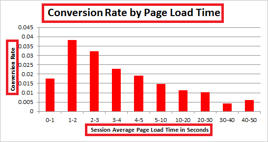
#6 Nonresponsiveness

I’m sure we’ve visited websites where you have to scroll horizontally. This is an absolute no-no in modern web design. A good designer will develop websites that fit on most screen sizes. The currently optimized layout for websites currently is 1024 x 768 pixels.

Suggestions: It’s hard and almost impossible to cater the design to fit every resolution especially when visitors are now surfing from mobile phones and netbooks, but we can get a rough idea what are the generally used screen resolutions with these following ways:

  • Check your stats – Analytic services like Google Analytics provides you information about what monitor resolution they are using. These are useful information you should know before initiating your next revamp.
  • W3 Schools Browser Stats – W3 Schools gives clear lists of the most popular browser used by netizens and sort them according to popularity. There are other interesting and important statistics too.

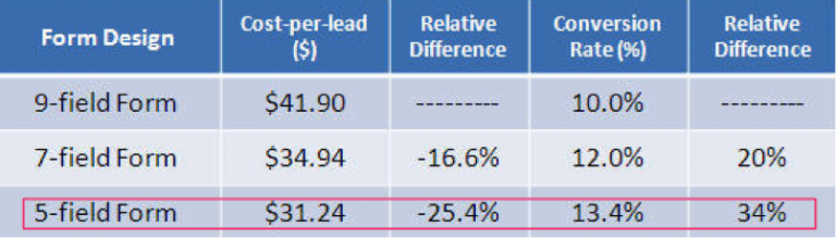
#7 Complex Registration Forms

Registration forms are tricky. How much information do you require from the user? Gone are the days where a user had to enter a zillion details to register to your website. Some websites make most registration fields mandatory and validate the fields to the extent where the user is frustrated after a few tries. Remember, users, visit a website to acquire information. Not the other way round.

Someecard‘s simple form makes registration painless.

Suggestions: Compare registration forms across communities on the web and understand what basic information is required of the user during the registration process.

More: 9 Common Usability Mistakes In Web Design – This post on Smashing Magazine takes an in-depth look at registration forms amongst other usability mistakes.

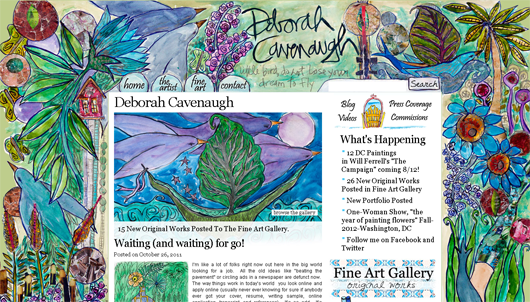
#8 Deceitful Images On The Website

Too many images on a web page is a huge turn-off. Images can be used to capture users’ attention but it can also be a distraction or just plain aggravating. Images should be used to illustrate and guide the user where appropriate.

Animations are awesome and a powerful medium. Especially when used appropriately. When it’s a cycle or just too much on a web page, it gets on the users’ nerves. Users don’t have the patience, time or resources so designers must offer alternatives or better yet, the skip button if it’s a full page animation.

More: Flash: 99% Bad – Use Flash appropriately. It’s been almost 10 years since Jakob Nielsen published this article but it’s still relevant in terms of Flash usability especially the Breaks Web Fundamentals piece.

#9 Jumbled Pages, More Blank Space

Too many designers forget about whitespace and its importance. They are so engulfed in their own design creativity that they forget that it’s not about them. Thus, they try to cram as much as they can onto a single page. End result? A busy, cluttered and unreadable page.

kylestanding make good use of whitespace in their design.

Here are few articles to give you a good idea of the importance of whitespace in web design:

#10 Background Music, Huge Setback

Users don’t want cool, they seek efficiency. And yes, 99 percent don’t care about the music on your website. Some designers make it worse by putting different background music on every web page.

Suggestions: Don’t use background music, but if you must, create a frame for the code and user controls. That way, the music loops continuously, instead of changing each time a new page is loaded within the website. And the user can stop or pause whenever.

WRAPPING UP

K.I.S.S is the bottom line, oh I meant Keep It Simple, Stupid. And that is actually what people are liking most in a website, if it is simple, it’s easily usable.

Hope you have gained much of insight on common web design mistakes.

With mistakes, also comes inspirations, so don’t forget to read Top 10 Web Design Trends and Few Ways To Make Your Site Easily Accessible.