Recently we have launched many new themes and plugins to give that attractive look and provide that much needed power to your website simultaneously.
This blog post is dedicated to summate all Weblizar Products at one place creating an index for all you people so that it wont be tough for you to scrabble through all the products.
PLUGINS
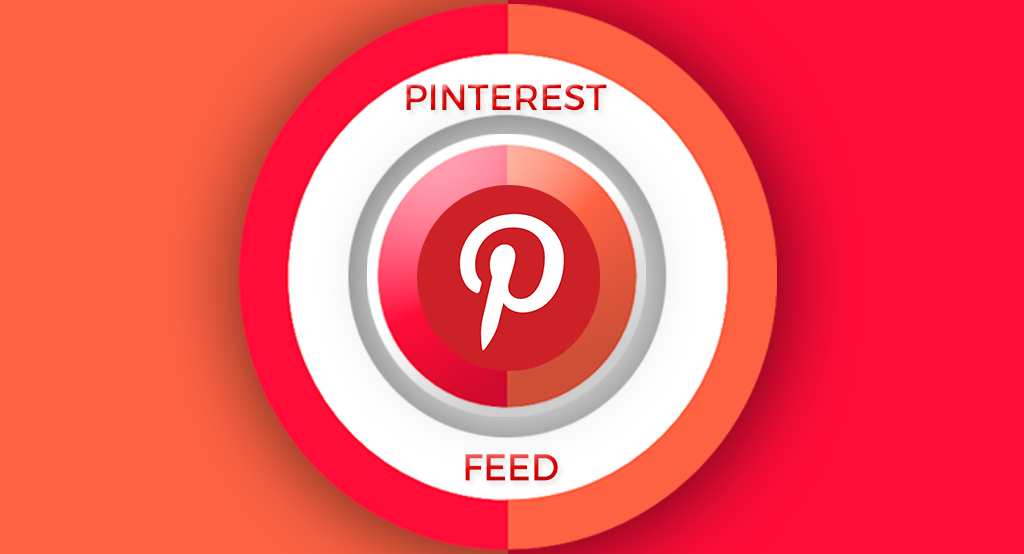
Display Pinterest Feed Like Profile Stats Boards and Pins on WordPress Website. Pinterest Feed Shortcode and Pinterest Feed Widget Available In The Plugin.
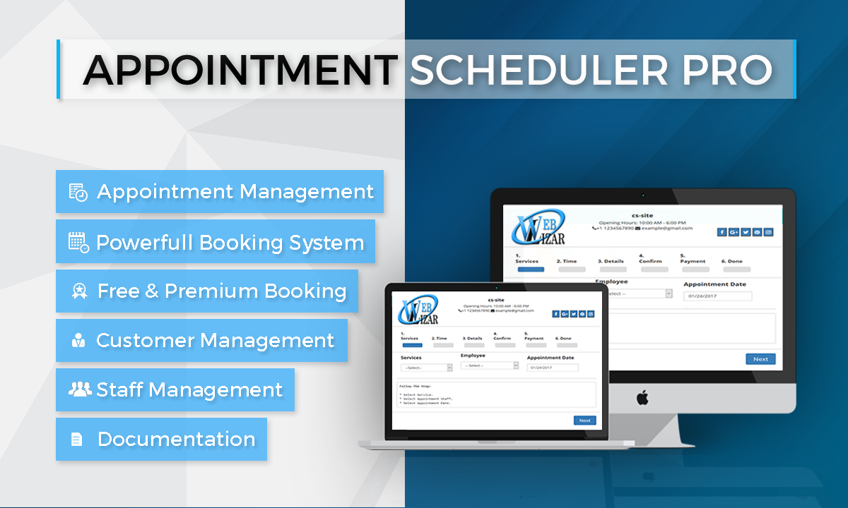
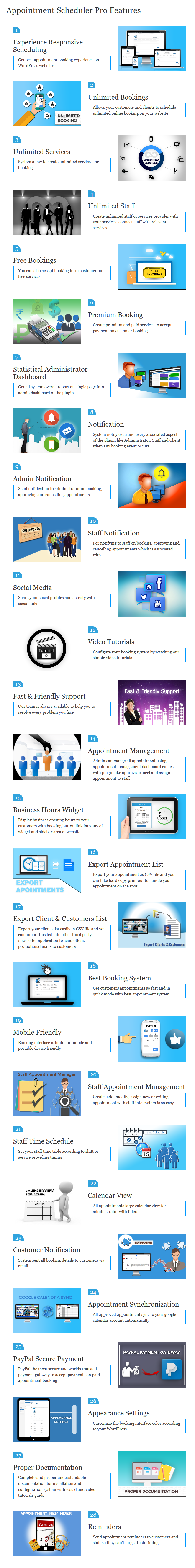
Automate your appointments scheduling and maintain them all at one place through Appointment Scheduler. Go carefree as far as your clients appointments is concerned. Appointment Scheduler Pro will take care of the rest.
SEO Image Optimizer is a SEO friendly plugin. This plugin dynamically replaces title and alt tag of images. All changes will done without effecting the database. Plugin also resized and compressed the images to boost your site speed. So activate the plugin, give a pattern and you are ready to go.
Plugin are track Subscribers with Auto and Manually Notification mail system. It increase your traffic on your website. Subscription Form are provide the different type of forms.
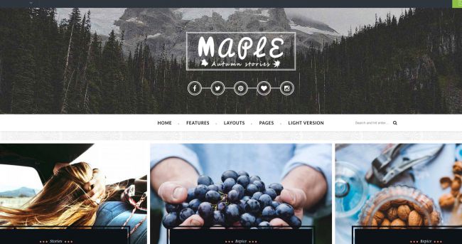
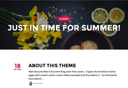
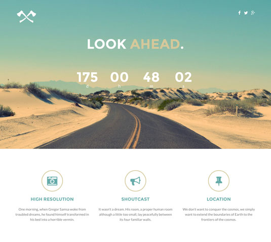
Create website coming soon page, launch page, under construction page, under maintenance page, landing page using beautiful responsive premium templates with multiple features like background color, slide show, YouTube, Vimeo video background count down timer, newsletter subscription form, about us, services, team, contact us, business location on Google map, social media profiles and many more.
Show recent and related posts and pages using shortcode & widget on your WordPress blog.
Display Your All Blog Users Profile in Various Style.
With Gallery Pro you can Add unlimited images on your blog site. Design various types of image, video, link gallery using this plugin. Gallery Pro provide you light box image preview and two gallery layout with various fonts.
An awesome gallery plugin to plublish Flickr Albums on your WordPress blog site.
Display your WordPress content link Photo, Video, Link, Image etc in Gallery format With CSS3 Hover Animation & Display With Lightbox.
A Perfect Responsive Image Slider plugin for WordPress. Contain 5 types of slider layout. Tested on all browser like Chrome, Mozilla, Safari, IE etc.
A very fast & easy way to display your Instagram images as gallery on WordPress blog.
A Perfect Responsive Portfolio Plugin for display content like images, vimeo/youtube video, Albums etc.
A Complete Lightbox Gallery Plugin With 8 Types Of Lightboxes.
A Highly Animated Image Gallery Plugin For WordPress
THEMES
Corporal Premium is a responsive and fully customizable template for Business and Multi-purpose theme. You can use it for your business, portfolio, blogging etc. Custom menus to choose the menu in Primary Location that is in Header area of the site which is ideal for creating a corporate/business website.
Explora Premium is a multi-purpose responsive theme coded & designed with a lot of care and love. You can use it for your business, portfolio, blogging or any type of site. Explora is Responsive and flexible based on BOOTSTRAP CSS framework that adapts your website to mobile devices and the desktop or any other viewing environment.
Explora focusses on the business template, awesome Caroufredsel slider, Powerful but simple Theme Options for full CMS control option to match your logo & website, wide layout, light & dark color skin, translation ready and much more. Explora is Woo-commerce Ready theme.
Scoreline is a responsive and fully customizable template for Business and Multi-purpose theme.The Theme has You can use it for your business, portfolio, blogging or any type of site.Custom menus to choose the menu in Primary Location that is in Header area of the site. which is ideal for creating a corporate / business website.
Scoreline is Retina ready.We focused on usability across various devices, starting with smart-phones.scoreline is a Cross-Browser Compatible theme that works on All leading web browsers.In footer area theme offer the Social Media Links to add your Social Links here. translation ready and many more.
Beauty Spa Premium is a simple and easy to use, powerful and professional looking, resourceful and responsive WordPress beauty and spa website theme. BeautySpa is a flexible and versatile platform for webmasters from all walks of life, regardless of previous coding experience, to quickly and effectively put together the most amazing and sharp looking websites dedicated to the Beauty Spa , health center, salon, spa and related service industry ventures and eCommerce Ready.
Beauty Spa comes packaged with readymade, fully functional demo websites with all the necessary inner content pages to start off your spa or beauty salon website in a matter of minutes.
Beauty Spa focusing on the business template, awesome Caroufredsel slider, Powerful but simple Theme Options for full CMS control option to match your logo & website, wide layout, light & dark color skin, translation ready and much more. BeautySpa is Woo-commerce Ready theme.
Beauty Spa is packed with useful features indispensable in crafting an outstanding online presence for your beauty and spa business. It includes custom page templates for services and photo galleries of your business. Moreover, it has a ‘make an appointment’ button to help them easily schedule a treatment session at your spa business.
Beauty Spa Premium WordPress Theme is versatile health care business WordPress theme suitable for spa, spa salon, sauna, massage , medical business, massage center, beauty center, eCommerce and beauty salon websites.
Healthcare is a perfect solution for any medical and healthcare-related businesses. Healthcare is a fully dynamic, well structured and beautiful WordPress theme which is specifically designed for hospitals, health clinics, dentists and everyone else involved in health services. You can use it for your business, portfolio, blogging or any other type of business vertical to make your website.
HealthCare is Responsive and flexible based on BOOTSTRAP CSS framework that adapts your website to mobile devices and the desktop or any other viewing environment.
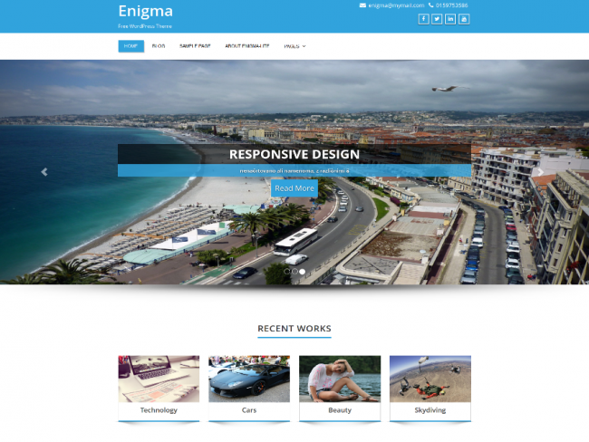
Enigma Premium theme is a super professional one page WordPress theme for modern businesses. Ideal for creative agencies, startups, small businesses, and freelancers and best of all it’s so easy to use that you can have your website up in minutes. Perfect to promote your work or your creative business. It is cross-browser compatible, fully responsive, and retina ready.Enigma is one of our most customizable and flexible themes, you can create practically unlimited versions of your website, your imagination is the only limit. It includes an awesome slider, filterable portfolio, beautiful galleries, different background patterns, rich color changer, light/dark color skins, boxed/wide layout styles, additional page options and much more. Compatible with WPML & Woo Commerce Plugin.
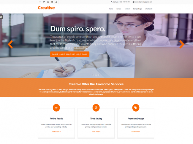
Creative Premium is perfectly scalable, performance and responsive, multi-purpose WordPress theme and suitable for Business. Perfect to promote your work or your creative business. It is cross-browser compatible, fully responsive, and retina ready.Creative is one of our most customizable and flexible themes, you can create practically unlimited versions of your website, your imagination is the only limit. It includes an awesome slider, filterable portfolio, beautiful galleries, different background patterns, rich color changer, light/dark color skins, boxed/wide layout styles, additional page options and much more. Compatible with WPML & Woo Commerce Plugin.
Incredible Premium is an incredibly superfine multipurpose responsive theme coded & designed with a lot of care and love. You can use it for your business, portfolio, blogging or any type of site.
Incredible is Responsive and flexible based on BOOTSTRAP CSS framework that adapts your website to mobile devices and the desktop or any other viewing environment.
We focused on usability across various devices, starting with smartphones.Incredible is a Cross-Browser Compatible theme that works on All leading web browsers.Incredible is Retina ready.
Chronicle Premium is new WordPress Theme styled with modern design and follows latest trends in Websites. Coded with HTML5 standards and SEO recommendations.
Chronicle is fully responsive and works on all Desktop & Mobile devices and all modern web browsers. Customization is fully integrated into WordPress native customizer and you can see changes in real time. Our Theme Builder, where you can click select and drag & drop sections of Theme, is included as well.
Guardian Premium Theme is a super professional one page WordPress theme for modern businesses. Ideal for creative agencies, startups, small businesses, and freelancers and best of all it’s so easy to use that you can have your website up in minutes.
Perfect to promote your work or your creative business. It is cross-browser compatible, fully responsive, and retina ready.Creative is one of our most customizable and flexible themes, you can create practically unlimited versions of your website, your imagination is the only limit.
It includes an awesome slider, filterable portfolio, beautiful galleries, different background patterns, rich color changer, light/dark color skins, boxed/wide layout styles, additional page options and much more. Compatible with WPML & Woo Commerce Plugin.
Introducing Green-Lantern, a premium WordPress theme. With its light and clean design it’s a smart choice for big companies, smaller businesses and freelancers. Green-Lantern has everything you need to take your company to the next level, but most of all it’s extremely easy to set up and use: your new website we’ll be ready in no time.
Green-Lantern is creative, modern business theme, with responsive layout and multipurpose design best for corporate sites. With Green-Lantern you can easily build your business sites quickly.
Weblizar Premium theme is a super professional one page WordPress theme for modern businesses. It is cross-browser compatible, fully responsive, and retina ready.
This professional online store is designed by qualified developers in accordance with modern standards. It combines a compelling look with a great functionality and smooth navigation that ensure a first rate buying experience to the customers.
Please feel free to get in touch with any suggestions or queries at lizarweb[at]gmail[dot]com.